Thursday, 30 April 2015

Layout for Blue Fern Studios April post.


 HI there!
I hope you all enjoyed the shadowbox from my April post on the Blue Fern Studiosblog! The second project that I shared is a layout, which as you know is what I would normally make. :-)


I used several of the gorgeous papers from the 'Deja Vu' collection, Nowadays I really like working with the colour purple.(As opposed to when I first started scrapping when I found it such a 
hard colour to work with). I just love the purple/yellow combo here.


To emphasize the purple tone of the papers I decided to paint my chipboards purple as well. 
I used part of the large chickenwirepurple panel and Deja Vu dangles.


I used most of the papers in the collection and had so much fun trying out what papers to mix and match. I distressed and layered some of the journalling cards in the center as a mat for my photo. 
The photo is one of the series that was taken by the talented Paula Pascual when we met at Sizzix
in Wales last Summer. It was fun!


I also coloured some of the flowers with paint to make them match better. As most of my stuff is in boxes at the moment due to the move I am really challenged to find enough other supplies to complement what I have. That's why I had to paint my flowers ;-) It is really a strain on Mrs. Mojo!
If you look closely you might even notice I used some of the new Deja Vu stamps. ;-)


Finally I have a page for you that I made a little while ago, -actually at the end of last month. 
It was done for the Blue Fern Studios monthly sketch challenge. 


And below is the page that I made with inspiration from the above sketch. 


Okay, that's all for now! 
Thank you for checking out Blue Fern Studios and my projects.
See you next month!


Tuesday, 28 April 2015

An off the page project for my Blue Fern Studios April post.


Hello friends!
It's the end of the month and I am up on the Blue Fern Studios blog with a project or three!
I used the new Deja Vu papers. It is such a pretty collection!
I also used beautiful Blue Fern Studios chipboards. 

I wanted to share my first project here and it's an off the page project.
Such an easy project but it still has the 'cute' effect .-)
The small shadowbox was a leftover from some used up scrapsupplies.


I painted the box with diluted gesso and added small areas of green/pink paint. 
I wanted to make the shadowbox with some pics of my youngest dd, Beatrice.


I painted the branch and added a couple of mini roses to it. I glued pictures and some journalling cards to the back and proceeded to decorate the box with flowers etc. Fun!!


Thanks for dropping by! Delighted to 'see' you :-)
Have a good week!

<3 <3 <3

Monday, 27 April 2015

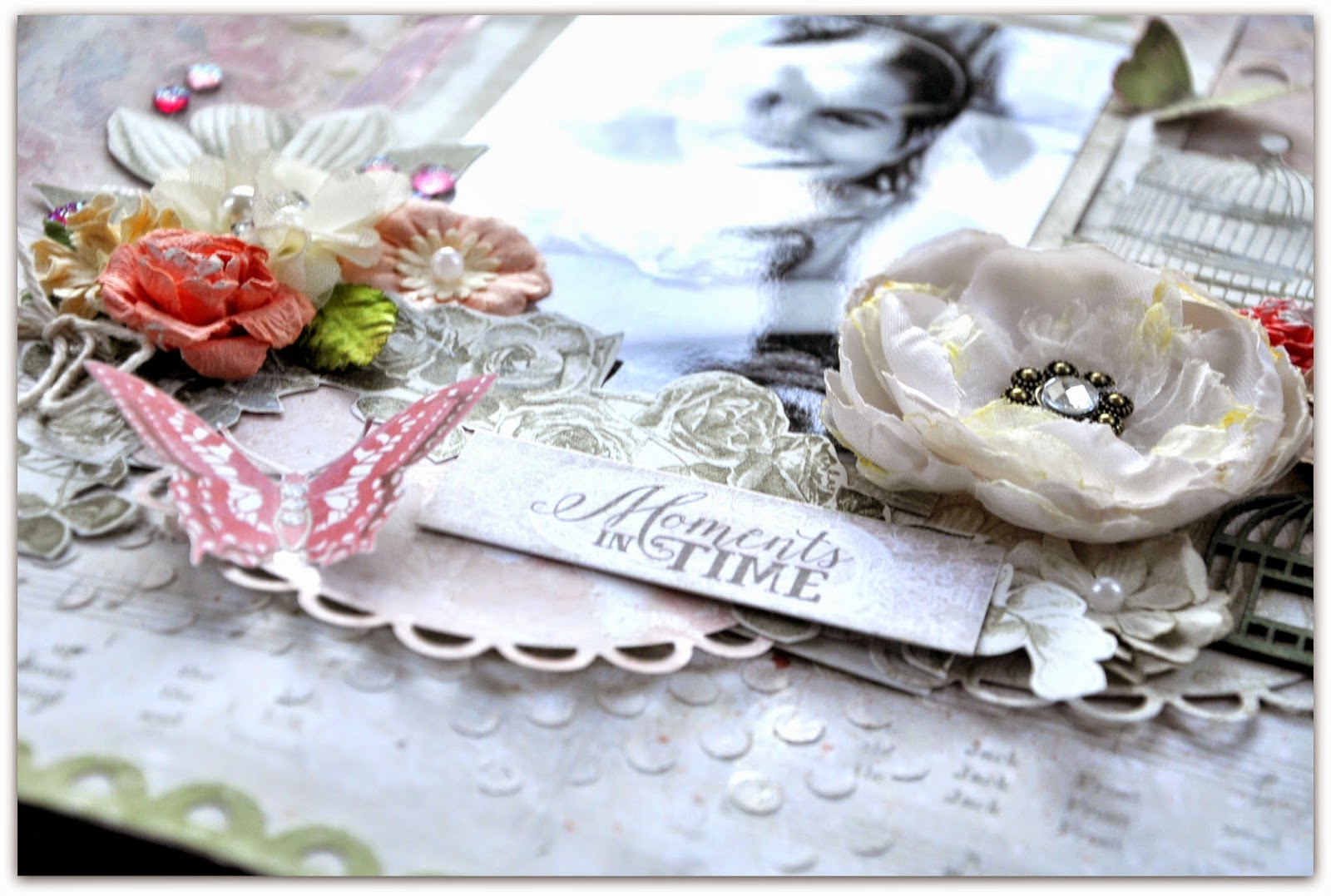
'Moments in Time' for Lemoncraft, using 'Heart painted'

I was so happy when I received the latest papers that Anna/Brises created for us. 
Surely you all agree it is simply a beautiful and well composed collection! 

As usual I have prepared a couple of scrapbookinglayouts to show you how I use them. 

Here's my first page with a picture of my youngest daughter and our little cat who thinks she is the boss of our house :-)


 Here are a few close ups of some details.


In the picture above you can see the beautiful white fabric-flower from Lemoncraft. It has some lovely stones in the center to make it something extra.
The large bloom in the picture below is by Prima Marketing.


I used a couple of Sizzix dies here, The round one is the gorgeous scallop circle, which happens to be one of my real favourites!!  I also used the row of scallops that came with the starter set of the new Big Shot Plus. (Love, love, LOVE it!! See it HERE )
Everything else was fussy cut from the Lemoncraft patterned papers.
I spent quite a while in front of the TV cutting out pretty designs.


In the background there is some mixed media light going on. The title is by Blue Fern Studios as is also the dainty little caige that I painted a neutral dark green colour.


Layering cute suplies is so much fun!
The largish butterfly in the picture below is cut out and glued down with a pop dot.


Thanks for looking!

Have a great week! <3 <3 <3

Wednesday, 15 April 2015

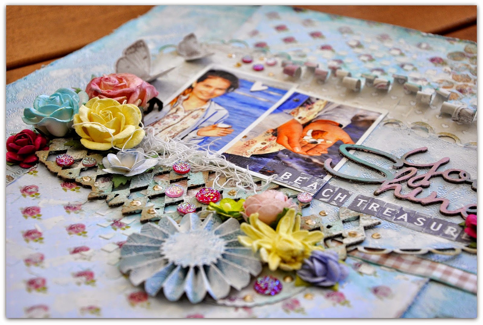
Something blue for Lemoncraft.

Hi there. This is turning out to be some seriously beautiful Springafternoon!! 
I shouldn't really be inside, but I am trying to get the last things sorted before I move to my new appartment in a couple of days.! I still have not caught up as far as posting my projects here
 so I thought I'd share a page I did for Lemoncraft a little while back.


 I used papers from the lovely and delicate 'Forget Me Not' collection that is predominantly a gorgeous blue colour.It's got beautiful flowery patterns as well. It's a favourite :-)


I used a die that Tim Holtz designed for Sizzix to make the rosette flower (below) and did some cute paper rolling to add some extra interest to my page. Some of the pretty flowers are sold by Lemoncraft and others are by Prima or Papirdesign.


The chipboard title and other bits here are by Blue Fern Studio and I treated them with some paint, mist and gesso. On top I added some liquid pearls.


 I am a very big fan of the stecil that Finnabair made for Prima. It's like a mini checkerbpoard. I could use it on almost all my pages,...( and probably do,..lol!)


Stickers are by Papirdesign., but October Afternoon make similar ones. 
What's so great with these are that they have all the odd and special letters you'll find in the Scandinavian alphabet and that's just so cool!!


That was all for now!! 
I hope you like this and thanks for any comm ents in advance. 
I love to read your little messages! :-)

Take care!! 
Related Posts Plugin for WordPress, Blogger...