Showing posts with label buttons. Show all posts

Tuesday, 25 February 2014

New collection *Forventning* from Papirdesign layout 'Family'

Idag har jeg laget en side i nydelige lilla toner med de nye arkene fra serien 'Forventning'.
De droppet ned i postkassa igår og jeg var jo selvfölgelig nödt til å 'pröve dem' med det samme. 
-Det blir kanskje litt som når mannen får en ny bil eller noe sånt.
-Og en flott måte å feire bursdagen min i dag!!
I hvert fall er det sånn att duften av nye papir er noe helt spesiellt :-)

Today I want to share a page with you that I made with the fresh from the printers new 
collection 'Forventning' I picked some papers in a fave shad of purple/lilac.
I received these yesterday and just 'had to' use them right away. 
What a great way to celebrate my birthday today!
There is something very attractive about the smell of newly printed papers.

Dessuten fikk jeg rotet litt blandt blomsterstäsjen og fant mye fint som passet.
Men det er jo ikke så rart med det enorme utvalget fra Papirdesign!!

I even dived into my flowerstash and came up with some beauties. papirdesign really 
has a large selection!!


Ett chipboardord  fikk utgjöre tittel for min layout og jeg synes at den passer veldig godt til både blomster og herlige papir.

The chipboard title is also by Papirdesign and I love the font that goes so well with the 
feel of my page.

 Jeg brukte ett lilla flöyelsband fra en Papirdesign båndpakke.

I used a piece of lilac ribbon also by papirdesign for my bow.

Nytt for denne sesongen er att papirdesign også har kakeservietter, som også kalles doilies.
De finns i to störrelser og den lille pakken har ti styker hver av fargene rosa, röd og hvit.
Den större störrelsen finns med 30 herlige hvite doilies.

New this season from Papirdesign is also that they have doilies. They are available in two sizes and each have ten pieces each of the colours pink, red and white.


Jeg tar med ett par extra blder på de fine dekorasjonene her.

A couple more close ups of my embellishments.


Takk for at dere tok en liten titt in her og forhåpentligvis har der fått litt inspirasjon!!

Thanks for dropping by and hopefully you were able to find some inspiration here today!

Dette er hva jeg har brukt/ These are the PD products that I have used:

Forventning -En ny vår
Forventning -Sommerfugl i solskinn
chiboardark - Baby
halvperler -lilla
gardenia -lilla 
miniroser/aster forskjellige farger
doily -10 cm
peoner -hvite, lilla
stempelplate -Strikk
lilla bånd
rosenknopp -lilla, rosa
grönne blad
buttons -Stjerner og hjerter

Sunday, 14 July 2013

Paper Issues, Pretty Little Studio 'Nature Walk'


Hi there, and a warm welcome to Paper Issues Nature Walk blog hop.

I am so happy you found us. You should have arrived here from the lovely Becki's blog but If this is your first stop please be sure you head over to  Paper Issues to start at the beginning.

Our current sponsor is the delightful 'Pretty Little Studio' and we even got some of their cute products to use on our pages.

Here is the page I made:

I used the different sized feathers from the diecuts we received. I also cut around a couple of the sticker ones to add to my 'feather-cluster'.


The patterned papers and the flair button I used are from the previous and current collections from the French manufactureres Les Papiers de Pandore.


Hopefully we will see many projects linked up for this issue. 
If you don't have any  products by Pretty Little Studio the theme to link up is Nature Walk.

 Aimee Madderns foto.

You can  link up anything that fits our theme to help you win to win the $10 gc to the PLS store.

Now, keep on hopping; in this order: 


You are here ........   Bente...........You are here


Thanks for hopping with us today!
Be sure to do the following:
    Now that you have had a peek around my blog:

    1. Like Pretty Little Studio on Facebook {tell 'em Paper Issues sent ya}
    2. Like Paper Issues on Facebook. {thank you!!}
    3. Leave a comment saying you want to win!

    Bonus!!  Link up a project!
    Please continue the hop to the talented Carol's blog!

    Thanks for looking!


    Thursday, 28 March 2013

    Two more pages for 13 Arts and a small toot.

    Hi friends, today I just want to do a quick share of two pages  made a little while ago for the Polish brand 13 Arts. Aida, aka Ayeeda is the multitalented owner and she has designed two very cool collections so far. You can see the entire collections on the 13 Arts blog.
    For my pages I have used a  combination of both collections and they are a perfect match.
     
    I scrapped a cute photo of my niece and god-daughter.
    I distressed the papers and cut a frame from the brick-paper. I added bits of the brick paper to different areas of the background as well. I  misted cheese cloth to tie in with my colours, and used mist and gesso as well.
     
    The small roses and the pink 'twig' is by 13 Arts and the large pink bloom is by Manorhouse Creations.


    My second page has photos of Beatrice and our kitten Lady.


    I used a mask with gesso on top of the patterned paper and also a some chartreuse coloured mist. I painted around the edges with some  green acrylic paint. I recycled a piece of corrugated cardbard as a backdrop for my photos. 
     
     
    The large part of the flowers are by Prima Marketing and some others are from my stash.
    The title is cut from one of the patterned papers.


    I coloured some white mini roses using Luminarte colours and they came out beautifully coloured and slightly shiny.


     I just adore that beautiful deep aubergine coloured flower by Prima Marketing!!

     
    Finally I would like to share a small toot. Another page I made for 13 Arts was noticed by Karen at Manorhouse Creations and is part of their monthly 'Spotted' feature.
     
    Here it is:


    Thanks for looking in and thanks for all the kind comments you leave me.


    Wednesday, 20 March 2013

    Guest designing at 13 Arts!!!

    I was delighted a few weeks ago when I was offered to be a guest designer at 13 Arts, the trendy Polish manufacturer of beautiful scrapbooking papers.
    I knew of their two collections and also of their awesome and very talented owner/designer Aida Domisiewicz aka Ayeeda in the scrapping world, from among other places the CSI site. She makes the most beautiful textured pages. -And as you will see she even designs lovely papers.
    The latest news is that she is brancghing out into mists, gesso etc for mixed media work.

    Here is the first of three pages I have made so far, and I have a couple more in the pipline so to speak...

     
    I primed my paper with gesso and used a mask with large dots. I used different mists and ink on top and blended them. I wanted to accent the pink colours in the paper and show that they can easily be adapted to a romantic style.

    The pretty yellow flower is by Manorhouse Creations as well as the pink one.
    The white rose is from 13 Arts. I cut my title from the accessories-sheet which has a lot of great elements like banners and stuff.


    I love the look of the brick patterned paper. I cut a frame from it to go all along the edges of my page. I added some cute pink buttons from Doodlebug as a contrast to the paint and shabbiness of the overall page.
    The cute frame was made using a Sissix framelits die. It is one of my faves at the moment.
    And for the fence I used a die by Cheery Lynn.


    That's all for today my friends. I make this a quick one as I am having internet trouble (...again..!) and am typing this at work after hours....
    I hope you like my page and will be back to see the rest of what I made for 13 Arts.
    Soon I'll be back to share the new colour combo from Les Papiers de Pandore and my take on it!

    Hugs, and thanks for any comments!


    Tuesday, 11 September 2012

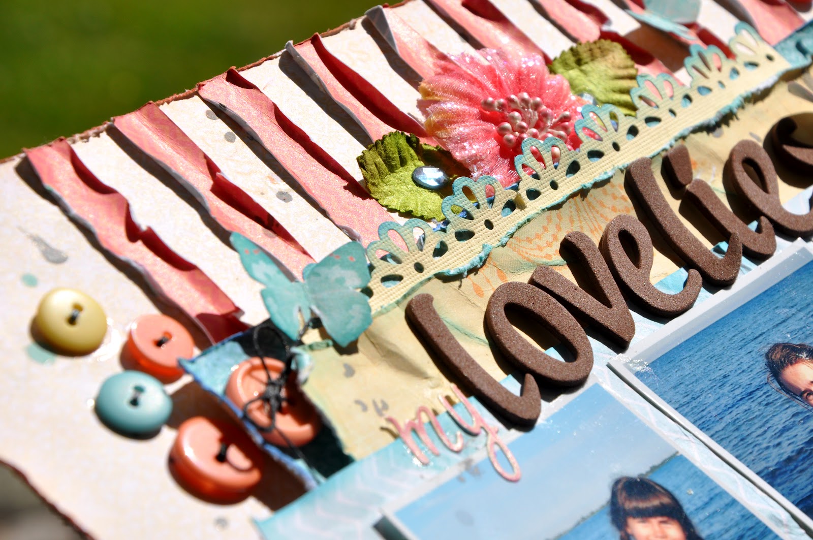
    'My lovelies'. A page and a cute sketch made from it on the Pandore blog today!

    I would like to tell you that  one of my pages is up at the "Les Papiers de Pandore" blog.
    It is for the monthly sketch feature that we have on the 10th each month.

    Without further ado here is the page and a very pretty and versatile sketch to go with it:


    To create my page I used the "Invitation" collection and just added a few pretty flowers and buttons.
    I also used two colours of mist (Sprinklers by "October Afternoon").
    I think the almost symmetrical design here is quite appealing.
    If you play along please share your pages on the Pandore FB page so we can all enjoy them.


                       I love the splashes of colour added by the distressed paper strips and the buttons.


    These photos were taken several years ago at a local beach and have been laying on my desk for a long time. I am happy that I finally got round to  scrapping  them. 
    Do you have photos too laying around your scrap space that you want to scrap but keep saving for later?. I know I do that quite a lot...


    One of my favourite,relaxing things to do as part of my scrapbooking routine is to cut out a few pretty designs from patterned paper. "Invitation" has some lovely  patterns that are perfect for cutting out to use as embellishments on your layout. All the butterflies here are cut from one sheet.


                              In the next photos I just want to show my layering more close up.


    And also a couple of photos showing some of the embellisments....The brown letter stickers were
    made by "Pink Paislee" and the pink ones are by "Websters Pages!"


    I hope you enjoyed my page and the Pandore goodness!
    Hope to see you again soon!

    Friday, 31 August 2012

    "So Proud" - Page in "Invitation" from Les papiers de Pandore.

    Hello my dear friends!
    I told you before that this Summer I developed a love for using strips of patterned papers on my layouts. Here comes one more example of that!


    I used the beautiful 'Invitation' by 'Les Papiers de Pandore'. I admit I grunged it up a bit but of course you you will still recognize the beautiful colours and patterns.

    Here are some close ups:


     Thanks for dropping by to have a look at my work. It is much appreciated!!


    .

    Wednesday, 15 August 2012

    I love Warwick Castle! 'To the Manor Born' one more page with 'Invitation'.


    Hi to all of you! :-)
    I may not say it very often but, really, I want to say Thanks for taking the time to visit my blog! 
    And thanks so much for all the beautiful and sweet comments that so many of you leave me.
    I am always so happy thinking I may inspire some of you as I find so much inspiration coming to visit your blogs! 
    Let me say; it would not be the same without you...LOL!
    Today I have another page using the latest one of the collections from Les Papiers de Pandore to share with you. This collection is called 'Invitation' and has an utterly feminine feel to it.


    The photos are of Victoria our middle daughter who is 17 years old. All of us girls spent a fabulous day out at Warwick Castle while visiting eldest DD Alexandra who is a student in the UK.
    Victoria was standing at the entrance to the old tower and I could see it made for a pretty photograph. 'Stand still,...click, click, click... She really looks like she belongs 'there'...lol!


    Again I made a collage of closeups to show some of my details on this one.

    I started off covering up an older sheet of patterned paper that had a pattern I did not want to use. 
    I added stips on top of this 'backing sheet' until I liked the look. I used both punched and plain strips.
    I made this during my vacations and I seem to have developed a certain love for using strips on my lo's during that time.... :-) You will see more of those in my next few layouts for Pandore.
    I  glued down all my bits and pieces while all the time adding strokes of gesso paint, mist, ink etc to build up the texture and stiffen it up a bit.I used a mixture of home made flowers and store bought.
    I also added a lot of yummy buttons that I made messy with some gesso.
    I hope you like it :-)

    Till next time take care!!


    Saturday, 11 August 2012

    Special Agent at CSI Color Stories Inspiration second week and a new page using 'Urbanessence'.


    Hi there, I am so happy to see you!!

    Last night (my time) was the reveal for the new color combination etc at CSI, Color Stories Inspiration.
    And today I have a page up at the 'Pandore' blog. You will find both the pages in this post.

    I will start with my page for CSI as that was revealed first.


    And here is Casefile #32 for you;-all the details will be there.

    Don't you just love these beautiful colours...?

    I want to share some close ups with you too: Those Corinne flowers by Ingvild Bolme are so stunning!


    I used glass glitter for one of my pieces of evidence (something grainy). And wet medium (paint, mist, liquid pearl, gesso). I have stars in my patterned paper too, and I embossed white cardstock for my photo mat.


    This is my testimony. I document a trip to the beach on our vacation.The pretty girls in the photo are my daughters and a couple of friends who came down to visit us for a week.


    And now to my page using 'Urbanessence', completely different in style :-)

    Todays layout is actually a page that I made a few weeks ago. 
    I made it for the blog at 'Les papiers de Pandore'. 
    There is so much going on over at Pandore with a very active and oh so fabulous design team that layouts sometimes have to wait a while to find a spot to be published.
    If you press the link above you can see all the latest posts and the beautiful artwork.


    Here are some closeups of a few little details on my page.


    The title 'Solskensungar' literally means 'Sunshinekids' even if there may not be such an expression in the English language.
    The photos are of my Beatrice and her younger cousin. It is not  an easy task to get him to sit still for a picture, but at least the charm factor is high...LOL!

    I drew a template for the large star to minic the smaller ones in the pp. I wanted to accentuate the yellow so I added some yellow buttons and twine. I also added a vertical row of twine between different papers for a little texture. The sewn outline around the stars were also for texture.
    This is an attempt to a clean page and therefore it does not have very much shabbyness in ways of bulky layers and distressing. I quite like how it came out still. It kind of works with the boy/girls page.

    I hope you all have a fabulous week end!!


    Related Posts Plugin for WordPress, Blogger...