Saturday 30 April 2016

'You are my Anchor' using Prima's 'French Riviera'

Can you believe it!!,...? Another post from me already... :-)
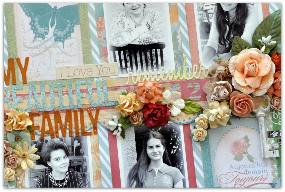
Today I have made another page with the French Riviera collection. 
I used an older photo of my two youngest daughters that was laying on my desk. 
We actually have some gorgeous beaches here up north, shame the temperature does nothing 
to make me want to go there,....


The pretty flowers I used are mainly by Prima from the Cartographer collection. 
I decided they were a great match for my theme. The small daisies are from Bedtime Stories.
I actually mixed in some paper from 'Tales of You & Me', between the layers. I wanted to 
experiment and see what that would look like....


 I love the look of the Art Stones that I coloured with Blue Fern Studios mist 'Sky'.


Those die cut leaves are so darn pretty!!


Another close up of the layering and decorations.


This photo was taken a few years back. I have a feeling the girls will probably protest that they don't look their best. You know: 'hair is messy' etc etc,..but to me they always look like princesses :-D


Well done for getting this far,... Only one more close up and I'm done,...LOL!
Actually, I like it when I visit a blog and there are many pictures of the details. 
I feel I can get a closer look at the page, almost as if I were there. 
What do you thnk? Do you like to look at close ups on your blog round?


I will enter this page into the April challenge over at Let's Get Sketchy.


Thank you so much for visiting today. I hope you have a nice and restful week end <3
Hugs!


Wednesday 27 April 2016

A mixed media page using Les Papiers de Pandore's 'Carte Postale'.

Hi there!
Today I want to share a page using the new Carte Postale collection from Les Papiers de Pandore.
I love these new papers and also the stamp-set that have matching designs. Soo pretty!
You can see the ollection HERE


This was a really fun page to make. I used many of my mixed media goodies with the Pandore papers.
I started with gesso and some mists, then I added some watercolour pencils and some different media and things for texture. The Finnabair art stones are great for just texture and even the tiny microbeads.


The beautiful Blue Fern Studios chipboard got a lick of white paint and I even stamped with a small script stamp on top. You can see how I added the art stones inside the tiny frames while letting the dotted washi tape underneath shows through.


Here I used the 'Say Hello' from the stamp set and made a kind of a title together with the word 'friend' from the Sizzix Tim Holtz Friendship Script Words.
This is one of my fave  die cut word sets.


The large white flower is by Prima and  the leaves were made with a die also by Prima Marketing.


A couple of more close ups.As you see here;  with just small means you can achieve a lot of texture.


Finally I would like to share with you the challenge at Scrap Africa where I will be entering my page:
I actually took the liberty of adding some yellowy tones to the mix . (Initially I saw the lighter greens as yellow on my screen) My page kind of evolved on it's own. I took my inspiration from the first and last picture of the board. I associated to layering and mixing things up very freely.
And that suited my mood just perfectly

This is the enticing moodboard over there.


I hope you liked my page and maybe even feel a little inspired to create your own version of a mixed media page. They are just so much fun to make!!

Hugs and thanks for looking!! 


Saturday 9 April 2016

'My Beautiful Family', using 'Invitation' by Les Papiers de Pandore.


Hello and Happy Week End to you all!
Today I have a page for you that goes to show that 'oldie can be goldie'.

I used an older collection by Les Papiers de Pandore for a collection of pictures of my girls amd me. It's called Invitations and it was just lying there in my drawer, still looking so pretty,... I had to pick it up and do something with it. 
Just to let the papers shine I tried to do a version of 'clean and simple here :-) I don't know how much I succeeded though,...


I cut apart the callingcards and placed them on a sheet of patterned paper as frames for my photos.


I used a metallic copper-coloured sheet and one of the papers from the collection to form my title cutting it with a Sizzix alphabet called Alphanumeric
This alphabet is fabulous and you get several letters of each so you can cut out long words in one go. Just look at it HERE  (There is also a 'marquee' variation of it...)
I am actually quite into the recent trend to use gold and other shiny metallics on your pages. 
I find it looks very pretty, although here it looks more orange than copper :-)


Just look at the cascade of pretty flowers down the center of the layout. Most are by Prima Marketing, but there are also some from  Norwegian Papirdesign, I Am Roses and others from my stash. The resin key is Ingvild Bolme for Prima and the small green/black stickers are by Basic Gray. 


The word 'remember ' is also a die cut using my Sizzix die set 'Friendship Words', which I really love!! You can see it HERE

Do enjoy your Saturday and Sunday as much as you can and hug your dear ones!
See you soon!

XOXO


Sunday 3 April 2016

'Sweet Summer Memories' using Prima's French Riviera collection.

Another page from me in less than a week.... 
Now that I have more time for scrapbooking I hope to have something scrap related to share on a more regular basis. I am using some of my new supplies and having a lot of fun. Do you remember the other day I told you I was working on a page using the new Prima collection 'French Riviera', 
well here it is:


I picked the pretty woodboard paper and played with some mixed media supplies on top. 
I used an older photo that was actually taken in Provence (where we have spent so many Summers over the years). This one was taken at least four years ago...

Here is a photo strip sharing my process:

1.Painting my flowers with some blue mist. 
2. Painting my doilies
3. The bare basics, page setup before adding photo and embellishments.


I used my Prima metal dies for the doilies and the leaves. I dyed the doilies using different mists and sprays (Blue Fern Sky, Prima color Bloom and another one from my stash I dont know the name of)


I used chipboard fromm Blue Fern Studios for a bit of extra texture. 
This one is called Quatrefoil Panel and I only used a piece of it.


I love the look of Fainnabair's gold mica flakes. They are so shiny and pretty and add 
a lot to the page. I even used some Finnabair Art Ingredients clear glass beads.  
I added them both to the Ingvild Bolme resin frame and inside the chipboard design.


I added a couple of yellow flowers from my stash to echo my DD's yellow shirt. The fabric flowers were part of a glorious RAK from my dear friend Eila, one of the nicest ladies in scrapbooking.


This is quite a layered page as you can see from this view. I used thick cardboard 
between the layers of paper and between the photo and photo mat as well.


That's all for today. Thanks for dropping by and for any comments you leave me. 
I hope you enjoy the rest of the week end!!

Related Posts Plugin for WordPress, Blogger...