Showing posts with label Blue Fern Studios chipboard. Show all posts

Friday, 25 December 2015

Discover Dream Explore for Blue Fern Studios

Hi. Time for part two of my December Blue Fern Studios share :-)
I used the Juliannas Dream paper from the magical Ombre Dreams collection. 
Such a beautiful and feminine collection, and so versatile too! I always love the combination of yellow with purple. I can't say why I Love it so, except I find it sooo,sooo pretty!


And even here I have close ups to share:


I painted most of my chipboard pieces purple and gave them a lick of gesso on top to make them a bit more shabby.The Chained Bits look great here down the side of my photo. They are a good background for layering any kind of embellishment.


The Timeless Floral corner adds so much to a page. It's so great because you can turn it
any way you want so it will work in any corner The flowers are a combination of older/newer Prima Marketing and flowers from my stash.


I wanted a title that was not too overpowering so I went with a single chipboard word that I painted and clear embossed. The letter stickers by Prima were very glittery so I rubbed them with gesso to reduce the shiny aspect a little. I added some punched and die cut greenery as well made with the Tim Holtz  Laurel punch and the Sizzix Garden Greenery die.


And to round things off I have a couple of simple Christmas cards that I'd like to share with you.


The first one I made with one of the cards from the Christmas card sheet and added the bottom strip from a sheet down the sides. I used the Petal embossingpowder again.
The Framed Winter words are perfect for a card front.


On my second card you can see that even other non-christmassy collections can be used for seasonal cards. My background here is from the Montage collection, but the top sentiment is from the
Vintage Christmas collection of course. I added some bits from the Chain link 
chipboard panel that I painted a dark red. I used a little of the Cotton Candy Imagine Ink
on the background and  a stencil on top.


That was all from me! 
Again; Thank you so much to Leslie and Valerie for having me on the team for the last year. 
It's been a pleasure!!
In Sweden we celebrated yesterday, but I wish my foreign friends a wonderful peaceful 
Christmas Day whether you celebrate or not.
Merry Christmas and Peace on Earth!


Sunday, 22 November 2015

'Sparkle' for Blue Fern Studios, using 'Vintage Christmas'.

Hi, today we received the first taste of snow for this Winter. 
Large, fluffy white beautiful flakes fell from the skies only to turn into a less attractive wet, slightly grey mush on reaching the ground. Living in this part of Sweden we are pretty used to that. Yesterday the neighbouring villages (maybe an hour from here) got something like 8-10 inches of snow but we only got rain. I guess it's because we are right on the coast and at the very southern tip of the country. But no doubt we shall have some more snow to enjoy (and not just to look at) as the year advances and we get into Christmas mode. I'm looking forward to that!! :-)


My page today is one that I made for Blue Fern Studios using the latest lovely collection called Vintage Christmas. So many gorgeous colours and designs in that paper range. Unfortunately the pictures are not as good as I would have liked, because of the darker days here at th moment.


I used the Petal embossin-powder on the Holiday vine and the title-word 'Sparkle'. It has a soft pink tint to it that is really attractive. I cut the vine in two to elongate it to fit my page. A little bit of 'cheating' can be hidden with a few flowers :-)


As you can see I used a fair amount of the Pyrite glitter on my page as well. So much in fact that half the living-room is shiny and there is glitter in the cats fur to my daughters delight. I feel I shall have to be slightly more careful next time,.... Woops!....


I used the Winter Mint spray to colour my background and stamped a few small snowflakes here and there.


In the recent box that I got from the super generous people at Sizzix UK there was a new paper punch size large  by Tim Holtz called Laurel. I used it to punch out the small twigs/branches acattered here and there in my clusters. Pretty cute if you ask me!


From Sizzix I also got the set to make the gorgeous Poinsettas you see here. The set is the Winter Wishes Collection and even includes a small gift box (pillow-box style) and is really great value for money! Check it out HERE

That was all from me today
Thanks for looking and have a great week!

<3


Sunday, 1 November 2015

A page for Blue Fern Studios November sketch challenge.

Hi there!
Today is the day the new sketch is revealed on the Blue Fern Studios blog and I want to share that with you here as well to make sure you dont miss it :-) It truly is a great looking sketch!!


Don't you agree?

And here is my page using the new Vintage Christmas collection so full of gorgeous design and Christmas cheer. I used Deck the Halls, Noel, and Greeting Cards, 


I love how the large piece of chipboard in the back mimics the crown on my daughters head. I actually thought of this photo of her the moment I saw the sketch. Here in Sweden we celebrate 
St. Lucia on December 13th  and it's kind of a festival of light and our family go to church to listen to our youth choir sing beautiful seasonal songs. It's very special. 
Last year Beatrice was picked to be Lucia and she was so happy about it!!


I wanted to keep the colouring quite simple and traditional for this page so I added decorations in red white and green mainly, as well as some hemp string.


I painted the large chipboard piece, and piece de resistance, with an acrylic paint in a golden colour.
The magnificent piece of chipboard is called French Ironwork. When dry I stamped it with the Essential Textures stamp and also embossed the pattern with the Petal embossingpowder. 
I even used the stamp on my background. The other stamp set I used was Parisian Ironwork.


 I cut the caption 'Christmas Joy' from the Greeting Cards paper.


 To get some flowers that would match perfectly I decided to pull out my diecut machine and make some from scrach. I added pop dots between the layers to make the flowers more realistic.
I inked around the outlines of the pieces to make them stand out more. 
I used red dimensional Thickers with glitter for my title.


I hope you enjoyed my first seasonal page of the year!!

You can read all about the November challenge HERE.


Sunday, 25 October 2015

A round canvas for Blue Fern Studios October sketch.


Hello again!
This round canvas is my second project for Blue Fern Studios this month. I had this canvas for a while, but being mostly a 'layout-girl' myself, I didn't quite know how to approach it. In the end I opted for creating the most beautiful and delicate background, (in my own humble opinion LOL ) 
just to cover the entire thing up..... I should have taken an in-between shot,... :-)


As inspiration for my canvas I used the October sketch by Michelle Singh. 
Lovely isn't it?


 I turned it upside down and took a free approach as you should with a sketch, 
but I think you can still see the resemblance. Read all about the challenge HERE.


I used calling cards from the Frolic collection as a title for my canvas.
The Butterfly Friends chipboard received a coat of white paint, some glitter and a light application of the green mist Imagine Ink Leaf. Also the large Frolic Mesh Bits chipboard was treated similarly.

I added a few leftover pieces of chipboard here and there, you can see them in the photo above. 
I dont ever throw those little tresures away :-)


Finally one more close up close up of the gorgeous Butterfly Friends, inked and glittered !


Thank you so much for taking a lok at my canvas and I hope you enjoy the rest of your Sunday!!

XOXO


Saturday, 29 August 2015

Another Blue Fern Studios page for August using Paisley & Vine.

August came and went, -very fast!  Too fast me thinks,...and now Summer is nearly over. 
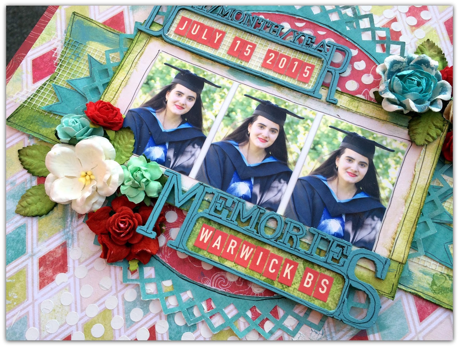
Here is a page that I made to remind me of a wonderful day in July  when we celebrated my eldest DD's graduation in the UK. It was such a magical day with lots of smiles.
I made this page for my August post on the Blue Fern Studios blog.


I used Passion, Playing cards and Splendor from the Paisley & Vine line for my graduation-page.


I thought the  Destination Labels were perfect for this. I mixed some paint to get one similar to the teal of the collection. And I used a black pen to outline the letters etc.


I like this photo so much I had to scrap three of it :-)


I added pop dots to raise some of my page- elements and create more dimension.

That's all from me today. Thanks for taking a look!!

Sunday, 23 August 2015

'Frolic in the Sun' for Blue Fern Studios.

Hi there! I seem to be nearing an all time low this month as far as blog posts go,....
I have been working a lot and with my school vaations and my eldest DD home fro the UK it's difficult to drum up time and energy. I do miss it though and today I wanted to share one of my August projects for 
Blue Fern Studios.

I am using the Frolic collection here and to me this is  possibly the most beautiful collection EVER!!!
Just look at those amazing colours and sophistcated designs.
 Michelle Singh did another awesome job with this one!!

I used the sheet Friendship from Frolic and the word chipboard word 'Memories' peeking out from below the photo is part of the Memeory Frames set. I painted it blue as I did with part of the title chipboard Frolic in the Sun. As an added decoration i used the beautiful Boston Lattice.


In this close up you can see how I painted the title and also how I clear embossed my lattice piece with utee (ultra thick embossing enamel) after painting it white.


I just love this shot of my DD from a couple of summers back :-)


I picked some colours that work well with the photo and had a play on the background. I made the tiny splashes with my old discarded tooth brush like my FIL once taught me. 

  
One last look :-)  


If you scroll down to the previous post you'll see the new Autumn Anthology collection from Blue Fern Studios coming to the stores in a couple of weeks. It feels like a continuation from this collection and I cannot wait to receive it. I think they will mix and match perfectly to ctreate amazing projects.

Thanks for looking!!


Saturday, 8 August 2015

A 'grungy' page and a reminder of the Blue Fern August challenge.

Hi there, finally the week end and some free time! Woo hoo!
I have been neglecting this poor old blog lately and I should probably have posted this last week, but here it is!! Better late than never ;-)

I used the Montage collection for my second project. I love all the lovely yellow papers in that collection:-)


And here are some close ups of the details.

I used one of the Memory Frames as my title and hid it partially behind my photo.


Making banner-pieces or mats behind the photos are such great ways to use up those left over pieces from your favourite patterned papers.


The arrows are from the Directions set and simply painted black.The swirly flowers were made using the starter set of the Big Shot Plus. 
I cannot say enough how much I LOVE the new larger platform that allows me to cut and even emboss up to the size A4 or lettersize.


And then over to the new challenge at Blue Fern Studios.


There are  just a few simple rules to follow if you would like to participate in our sketch challenge:

1.) Feel free to interpret the sketch as you please by means of taking it as-is or 
flipping/turning/mirroring it to suit your needs! 

2). Please note that you can do whatever type of project you please - a layout, card, 
  canvas, altered item- whatever suits your mood and style! 
We would love to see the different ways our sketch can be used.

3.) You must use at least one piece of Blue Fern Studios chipboard OR use Blue Fern Studios paper on your project. Please note that you do not need to use the pieces featured in the sketch
- use whatever suits your fancy! You can find the store nearest you HERE.
 {Do not use any other brand of chipboard on your project please!}

4.) Upload your project using the Inlinkz tool below by midnight EST on August 31, 2015


To link up or to find  more info you should check out the  Blue Fern Studios blog HERE.

Thanks for looking!!


Tuesday, 28 July 2015

'My first Home' for Blue Fern Studios.

Recently I posted a few pages on the Blue Fern Studios blog.
I was in the UK last week celebrating my eldest daughters graduation from university and must admit I am a little behind wity posting my projects here on my own personal blog,....But here is one of them !!


This page is based upon a pink paper from the Montage collection. 
On top is a paper from the Deja Vu collection. As yo can see the collections mix very well.
-Especially when you add a litttle mixed media here and there. :-)
I 'framed' the whole page with the largest sized Graduated Squares, painted white then inked around.


 The gorgeous piece of chipboard below the picture is one of the recent shapes and called
  Rock Wall Bits. I painted it beige, stamped on it and added some pink glitter. 
The part of the Grunge Frames chipboard piece visible above the photo was given the same treatment. 
I just love to add glitter to my pages at the moment :-)


The cute small dots scattered all over my page are the insides of then alpha stickers that I used.


Finally a better look at the Prima resin by Ingvild Bolme. It is such  a beautiful and decorative piece!!

That was all for now, Hope you feel a little bit inspired and that I'll  see you here again soon!
Take care!


Sunday, 12 July 2015

July challenge at Blue Fern Studios and a page.

Hey, it seems like July arrived very quickly this year!  Hardly any Summer to speak of until the first days of this month, but now finally the warmth has arrived!

At the beginning of the month as usual there is a new gorgeous sketch up on the Blue Fern blog.


I am sure you'll agree it's beautiful.

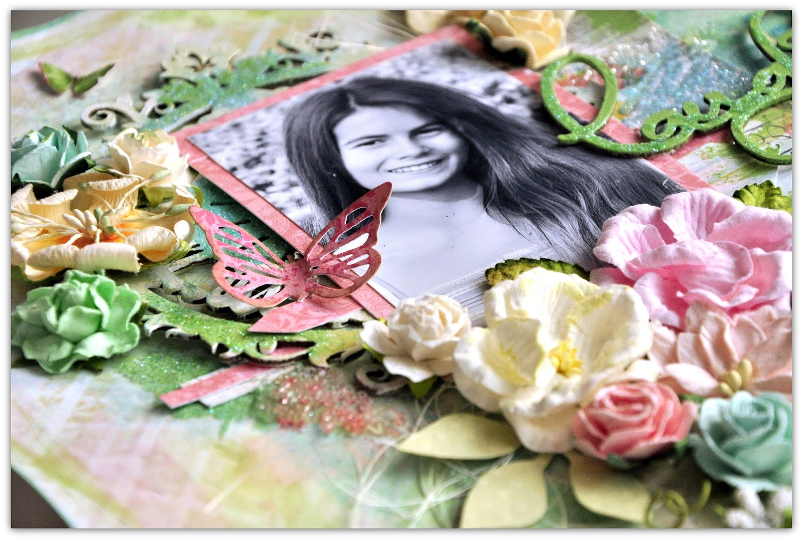
And of course I have a page to show that I made as sketch inspiration:


I usede a paper from the very first paper collection from Blue Fern Studios called Blue Fern Garden.

The chipboards I used are:
Laughter, Happy, Smile
and
Floral Clock.

....-And here are some close ups as well:


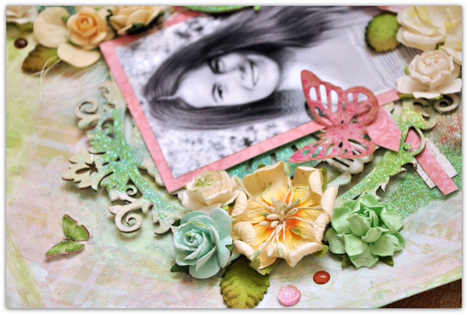
 I used lots and LOTS of glitter on my chipboards and on my background. Prima has some really great sets with lovely matching colours.
I also used mist and Luminarte water colours on my background.


 I ordered a new batch of flowers and I am loving the colours,.... -So Summery! I even added a sprinkle of enael dots and Prima 'glitter dots'(Say it in Chrystals).


To add the glitter and to get it to look kind of textured I used glue  that I added in 'lines' and then sprinkled glitter on top.


Here and there you can see some Prima glass pearls as well, from the Finnabair Art Ingredients mixed media collection.


And here peeking through is the gorgeous Blue Fern Studios Floral Clock. I used gesso on top before adding some watercolour paint, some glossy medium and finally the glitter.

Thanks for looking in today! See you again soon!!


Related Posts Plugin for WordPress, Blogger...