Hi there, I am so happy to see you!!
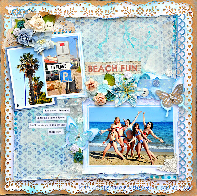
Last night (my time) was the reveal for the new color combination etc at CSI, Color Stories Inspiration.
And today I have a page up at the 'Pandore' blog. You will find both the pages in this post.
I will start with my page for CSI as that was revealed first.
And here is Casefile #32 for you;-all the details will be there.
I want to share some close ups with you too: Those Corinne flowers by Ingvild Bolme are so stunning!
I used glass glitter for one of my pieces of evidence (something grainy). And wet medium (paint, mist, liquid pearl, gesso). I have stars in my patterned paper too, and I embossed white cardstock for my photo mat.
This is my testimony. I document a trip to the beach on our vacation.The pretty girls in the photo are my daughters and a couple of friends who came down to visit us for a week.
And now to my page using 'Urbanessence', completely different in style :-)
Todays layout is actually a page that I made a few weeks ago.
I made it for the blog at 'Les papiers de Pandore'.
There is so much going on over at Pandore with a very active and oh so fabulous design team that layouts sometimes have to wait a while to find a spot to be published.
If you press the link above you can see all the latest posts and the beautiful artwork.
Here are some closeups of a few little details on my page.
The title 'Solskensungar' literally means 'Sunshinekids' even if there may not be such an expression in the English language.
The photos are of my Beatrice and her younger cousin. It is not an easy task to get him to sit still for a picture, but at least the charm factor is high...LOL!
I drew a template for the large star to minic the smaller ones in the pp. I wanted to accentuate the yellow so I added some yellow buttons and twine. I also added a vertical row of twine between different papers for a little texture. The sewn outline around the stars were also for texture.
This is an attempt to a clean page and therefore it does not have very much shabbyness in ways of bulky layers and distressing. I quite like how it came out still. It kind of works with the boy/girls page.
I hope you all have a fabulous week end!!


Really love the photo of all the girls. Both LO's look amazing. I think you did well with your 'clean' page.
ReplyDeleteOhhh wow Bente what a funny page for CSI...love that.
ReplyDeleteAnd I also love the second one pictures.
xx
Wowwwwwwwwwwww!! These are gorgeous!! I loveeeeeeeeee the colors, the flowers and the stars!!!
ReplyDeleteThe first one is absolutely gorgeous, got to be my new fave! so much fabulousness to see everywhere! you really did crack the case file beautifully! love the photo of the girls, h-a-p-p-y!
ReplyDeleteThe LPdP is such a wonderful one too, solskensungar indeed! that big star really pops!
Jag tycker personligen att det är på tok för många händelser på den franska bloggen, orkar inte ens kolla om det inte är du och vår vän på andra sidan jordklotet som är med. Hoppas ni har en kanonhelg! kramelikram
Nydelige Lo'er!
ReplyDeleteWow! What fun lo's! I really like how you picked up all the blue in the first one! The second looks so neat with all the stars and the banner...perfect combo!
ReplyDeleteWow!! Such gorgeous LO's!! ~ Blessings, Tracey
ReplyDeletehttp://gracescraps.blogspot.com/
KJempefine layouter, får virkelig strandfølelse av de.
ReplyDeleteIkke bare samme blomster, vi ser på hverandres sider samtidig...
Both are fabulous Bente!! Love the colors in the first one, your layout makes me wanna go on a trip :-)
ReplyDeleteLove the bold colors and your wonderful stitching in the second one. Cute photo's too!
Love both of these, Bente!
ReplyDeleteLove the colours, the punched edges & your gorgeous clusters in the first one. The second one I love the colours too...and the cute little banner & the clean straight lines. Fabulous photos in both layout too. Awesome work! :)
Great layouts! I love the blue colors and the stars. Really great!
ReplyDeleteReally hard to decide which one I like better!!! love the way you combined the punches on the first one, with the rich textures and then the line up ofphotos on the second is just awesome!
ReplyDeletegorgeous pages as usual - love your style
ReplyDeleteWow...two totally different layouts and both so very beautiful. My favourite is the first beachy layout....stunning.
ReplyDeleteJust beautiful! Really love the vibrancy of the blues in your first page, and the combination of patterned papers, in your second, is pure deliciousness! LOVE!
ReplyDeleteawesome LOs!!! so different, love them both! but the bright and happy colors on the first one are incredibily beautiful
ReplyDelete