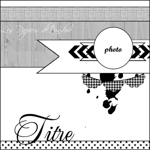
Time for a new sketch at Les Papiers de Pandore.
I loved the look of Julie's new sketch and had a lot of fun working with it. I decided on a slightly more C&S approach than my normal one, but am actually thrilled with how it turned out.
I think mainly because of the lovely colours in the pretty Pandore papers.
I loved the look of Julie's new sketch and had a lot of fun working with it. I decided on a slightly more C&S approach than my normal one, but am actually thrilled with how it turned out.
I think mainly because of the lovely colours in the pretty Pandore papers.
Here is the fun sketch that I used for inspiration:

I combined alphas fom Pink Paislee and JillybeanSoup to make my title, and stitched down the letters using my sewing machine. Both these alphas had kept well and did not actually need stitching down, but occasionally you will get one that has lost the ability to stick. Often I will just add some glue to the back, and voila!, but now and again, and especially on a more C&S layout I like to stitch across the letters.


This looks fabulous.. i love the fish tale banner taking center stage under your photo.. love the white space and the eye catching borders top and bottom!!
ReplyDeletelove it
ReplyDeletesoo beautiful!
ReplyDeleteGreat layout! I love the bright colors on it!
ReplyDeletekjempefin! Og så glade farger,får meg til å glede meg til sommer :D
ReplyDeleteFabulous page Bente and really like these colours, beautiful work.
ReplyDeleteYou rock the C & S too! An eye for design and color! Gorgeous! And love that photo. I can only imagine the experiences you had. I know just the few times traveling to other countries was so interesting. I love it.
ReplyDeleteThis really pops, the colours are so vibrant!
ReplyDelete