Monday 29 August 2011

"We Love You", another layout with "Promenons Nous"


It's Monday again and time for another one of my layouts to go up on the blog of Les Papiers de Pandore.

Once more I have focused on the lighter colours in the collection. The sage green and the chocolate colours will mix so easily with other colours, and especially pastels in my opinion. Here I have chosen to combine with a lavender/lilac tone. I think it looks quite fresh.


I was inspired to hand cut the clouds (from a paper I embossed with my Cuttlebug) by the little clouds that form part of the collection on the embellishment sheet. The beautiful little chipboard frame that I backed with musical paper is from Imaginarium Designs as are the two small butterflies that I painted lavender and finished off with some stickles. The tiny black letter stickers are by Basic Grey.


I created the title by combining Chipboard words, also from Imaginarium designs.
I painted the letters white with gesso.
The gardenias are mulberry flowers from my stash.


I inked around the edges of the papers with a brown ink pad and then I painted the edges of the green paper with lavender paint. I even smudged some paint onto the other papers.


I just love all the feminine elements on here and they go so well with the delicacy of the beautiful patterned papers.


Have you been able to get your hands on this collection yet? If you live in France you can find it in your local scrapbooking shop, but for all of you abroad I recommend you try one of the French online stores. I am sure you are going to love working with these papers. Next time on the Pandore blog I shall show you a page with some of the more deeper colours,...It looks quite different from this one!


I hope you enjoyed your little visit here. I know Blogger has been stopping people from commenting, which is sad, but thank you for stopping by anyway!
Enjoy your day!!


Sunday 28 August 2011

A birthday card for a musical friend


Tonight I just have a quick share. 
A short while ago I made this birthday card for a friend who was going to celebrate her fiftieth birthday.

I used bling cardstock as a card base. I added a paper strip that I had punched with my Martha Stewart lace punch. I also added a piece of October Afternoon paper with musical notes on it as my friend plays in a symphony orchestra. As a kind of background for my floral embellishments I used two journaling spots. The light blue one I drew and cut out by hand and the white one is a Spellbinders shape.
In the middle there are some mulberry flowers, a bling butterfly, and the letter stickers are by October Afternoon, too.

I think it is nice to be able to do this kind of a fast project now and then, and I find it so much more enjoyable to give away a hand made card when I have the choice.
I hope you like it!!


As always, thank you so much for dropping by.
Hope you are enjoying your week end!
Hugs to you!

Wednesday 24 August 2011

"Crate Paper" "Toybox", A layout just for me.

During my stay in France I made a lot of layouts, some I have shown you, with Julies papers from Les Papiers de Pandore.
I also made some with what I had brought from my stash. I always bring a big box of supplies and there's always something that catches my eye...

This was the first layout I made:


And some close ups to share before I go to bed...


As always thank you all for your visit!


Saturday 20 August 2011

Woot woot!..I had no idea I was scraplifted on the PInk Paislee blog last week...!

Good morning to you!


Hello everyone! Karola here with new Pink Paislee project!
Today’s topic of our blog post is : Member Mania – This means that I will choose a layout from one of the members in our Live Pink Gallery and I will use it as inspiration to create my own layout!  It’s a huge surprise for all the Live Pink members – you never know whose work will be lifted! There is so much inspiration, and lots of stunning, beautiful layouts, cards and altered items – we encourage you to visit the Live Pink gallery regularly!
So, I had a serious problem to select only one project to scraplift, but I found a gem, something that really impressed me – it’s layout called “My Sweet Girls” created by Bente Fagerberg:
Bente’s page impressed me so much, it’s classic scrapbook page with a little bit of shabby chic style look, gorgeous bright colors, beautiful and balanced composition… it’s gorgeous!
I decided to copy a fantastic composition and arrangement of images and accessories. I did it in my favorite colors with my favorite motifs. Here’s my version – despite the sincere desire – it’s definitely much more pale and soft than a Bente’s page:
On Bente’s page are a few paper doilies, I cut out my doilies using Cuttlebug,  recently I received a beautiful gift: a few new cutting dies in a doily shape, so I thought it would be perfect for this project. As Bente – I added frills around the background and tried to create a similar composition to her layout. I combined Mistables and Nantucket collections.
I thought I would add as the photo matting something special – I chose the Nantucket – Clam Bake paper, which I precisely cut out and so here we have slotted grille – it requires some hard work using craft knife and a while of patience, but I think is really worth it!
Because Mistables collection is designed for coloring in different ways – I was able to perfectly match its elements to Nantucket colors. Coloring the background of the Mistables paper I used Ranger distress ink – Tattered Rose. To color the beautiful muslin flower, frills and chipboard letters I used Glimmer Mists: Aquamarine and Cherub Pink – ideally suited for delicate and soft Nantucket colors!
Like Bente – I created a few small embellish clusters:
Here’s the last view from afar:
Pink Paislee products used:
Thank you so much Bente for a huge dose of inspiration!! Creating this Lo was a pure pleasure and much more easily with inspiration from you!
I encourage everyone to upload your projects made using Pink Paislee products to our Live Pink gallery – we love to look what you’ve created!
Have a wonderful day!

That was a nice reward for scrolling through the blog don't you think?

I can't believe my page inspired such a lovely piece of art. Our styles are very different but there is a striking resemblance when you see the pages side by side.

Thanks for looking!

Friday 19 August 2011

Time for a new Combo at CCG using "Garden Party" and a Pink Paislee SALE

Thursday again and a new challenge at Colour Combos Galore.

The challenge this time includes four gorgeous colours to be used in combination. And you also have a designers challenge to use woven material on your layout. I was not sure what kind of material to use so I grabbed one of my Webster's Pages 8x8 packets of fabric. The teal is a bit darker I think than the one in the photo but it works.
The colour looked one way on my screen, but when I printed a swatch it looked completely different....

This is the layout I made:


The papers I used are "Garden Party" by  "Les Papiers de Pandore". 
This is such a beautiful collection and the colours are just so so lovely!!
I used the teal sheet as my base and shaped the red pp to add in the centre. On top I placed a circle that I framed with a pink flower branch from Prima. I added a piece of the teal Webster's fabric around the branch and even made a bow. I even mixed in other flowers in the right colours.
The beautiful top and bottom swirls were cut from the patterned papers. Even the journaling spot I cut from the same paper. I laced my layout with a lot of gesso around all the edges and borders, that gives a subdued teint to the red colour.

This is the pretty Inspirational board telling us about the new challenge:


And here comes a few close ups:


 The beautiful chipboard butterfly was sprayed with Maya Road mists, but the colour came out much darker on the kraft coloured chipboard then on a white paper. (It almost looks brown IRL.,...unfortunately...)
I added a couple of half pearls to embellish the butterfly chip.


The title was written with Prima fabric letter stickers.
I know I have used this font a lot, but I really really LOVE it!

My journalling reads something like this:

" You are growing into a young adult
and every day we see more clearly
what a fine young lady you have become.
We are so proud of you!"


I just thought I would share this news from the Pink Paislee Blog with you:

They are having a BIG WAREHOUSE SALE again. This will be their 3d annual big sale and I greatly recommend it.
I have ordered on both previous occasions and have been excited with all the goodies that I received.

It goes without saying that I ordered one as soon as I saw this.
It is really a shame though that half of what you and up paying is postage.
Sometimes I think that you US-people out there are very lucky!! LOL!

This is not a very good picture that I copied from the PP blog.
But this link HERE will take you directly.


That's all for today my friends.
Come back soon, will ya...


Wednesday 17 August 2011

"Flowers for mum", -Les Papiers de Pandore, and guest spot at Imaginarium Designs


'Morning all and a happy Wednesday to you!
We are already more than half way to the week end...yeehhay!


Today I have a new layout to show you  with  Les Papiers de Pandore.

And I'm also thrilled to be the guest designer at Imaginarium Designs today (or yesterday aussie time...lol!)

I will start with the layout I made using Julie Blanc's latest gorgeous collection  "Promenons Nous". I am a little late sharing it as it already went  up on the blog a couple of days ago.

I do not understand what happens with the collection plaques that I posted, but I at least get a message saying "OverBlog" and no pictures.I do hope all of you can see them though!
If you get the same problem ,...the solution is to go over to the LPdP and look at the collection pictures there!


Even this time I have used the lighter hues of the papers to make a spring layout:


I had been grocery shopping (as always!) one day and when I came home Beatrice was waiting for me at the gate, a little anxious, with a small flower bunch  in her hand. She had just arrived on the bus from school and while she was waiting for me she'd picked some flowers. The look on her face I think is because she was worried I would be upset she had picked the very first flowers of the year...We took these precious snow drops inside and put them in a vase and we were both enjoying them for days!

Quite a few gorgeous paper layers here. The colours are so soft and easy to use. This is also one of the layouts I made while on holiday and just had to add the title and a couple of finishing touches when I came home to my stash. There are several more to come.

Maybe some of you would like a closer look?...


I used the big clock from the elements sheet. I seem to be 'into' clocks at the moment!
Hi hi...I am no good at keeping the time though...


These little bird houses come from the same sheet. I have just added a button to each and some twine.
I did something similar stitching the banner.
All the edges were distressed with my edge scraper, but I did not apply any ink because I wanted to keep my layout 'soft' with no hard edges,... so to speak.


Previously I said that you would soon see my rolled up paper strips again,...and voila: here they are.
But I think they add a small punch for no buck at all... Just sooo simple.
I also added some liquid pearl for decorations.


The brown letter 'stickers' are from the same elements sheet. There are at least two of each letters and more of some vowels etc. This style is all the rage right now.

In a day or two I will be back with a new LpdP layout that I  just finished for  Color Combos Galore .


My other news today is that I am featured over at the Australian blog of


Imaginarium Designs


They are kind enough to be sponsoring the whole DT over at Once Upon A...Sketch.
I just love their products and consider myself very fortunate to be using it!

Here is a small collage of the projects of mine that you can see on the Imaginarium Designs blog at the moment.

Click on the link and you can see larger versions of the photos.

(Once there you can even click on the photos and they will be very large.)


To those of you who have arrived at the end of this long post I will say 'well done!'
Hope you enjoy the rest of your day!


Monday 15 August 2011

"New Friends", for the August 15th challenge at Once Upon A...Sketch.


I have made another Pink Paislee layout to try and use up some of all the papers I've been hanging on to from the previous collections, now before the new collection start hitting the shelves.
I have said before that I love their designs and I have already seen a lot that needs to come home with me as soon at it arrives at the shops.
This layout is made using the latest sketch by my friend Nadia at Once Upon A...Sketch.
I also entered it for the Pink Paislee Hot Hues July challenge, which is open for a couple of days more.


AUGUST 15th CHALLENGE

Journalling Criteria: Write 2 sentences from the lyrics of your favourite song. Journalling can be in any language and can be any type i.e. handwritten, alphas, printed, rub on. 

You MUST combine our journalling criteria with the following sketch. 


We have some wonderful guest designers featured this month from our dear sponsors; 
The special invited guest artist for the month of August is the gorgeous Anabelle O'Malley.

I am so impressed with all the pages made by our talented guests and really advise you to click your way over there to have a look!!

I will now share some close ups:


In the photo you see my youngest daughter Beatrice and a little friend she made in Provence.
I die cut a sheet of yellow pp and matted my photo on a light blue piece.
All the edges on my layout were machine stitched and I added A LOT of mulberry and Prima flowers.


Our sponsor for the whole year is the awesome Imaginarium Designs. I used a branch and a small swirl of their chipboard on this layout. I painted them with gesso and then white paint mixed with yellow to match the colours in my layout.I even dotted them with some liquid pearl as well as using some to make some small 'pearl swirls' for my flower cluster. The red fabric letter stickers are from Prima.


Some may remember that I earlier this year cut up my daughter's t-shirt to make some banners for my Color Combos Galore layout. The banner here is made with the remains of thet t-shirt...lol! I don't think she has noticed yet.... Well, I had already ruined it so I figured I might as well use it ti hi hi hi...
I stitched my banner down with some messy stitches and added a small button with twine to each flag.
At the end of the banner I added a small diecut from Pink Paislee "Butterfly Garden" ephemera.


My quote is from an older German entry to Eurovision Song Contest . It is not really a favourite song of mine but one of my girls came up with it when I asked them for some lines about friends. It is quite sweet.


That's all for today friends.
Today on the "Les Papiers de Pandore" blog Julie posted one of my layouts.
I will get back to that one when I can.
We are celebrating my husbands birthday (50) on Saturday and we have a lot of preparations to do!

Thanks for dropping by!


Friday 12 August 2011

Color Combos Galore 204, "Snapshots from Provence".

This weeks mix at Color Combos Galore is a lovely combination of green, blue, light yellow and brown.
This combination lends itself to layouts for both boys and girls, but I think they are particularily good for those of you scrapping a masculine page this week.
In addition to the right colours the challenga also tells us to use a grid on our page. I was not very keen on the idea of a grid, but as I got on with my page I discovered there are many ways to use a grid and it does not have to be so very geometrical...!

Anyway, this is what I came up with this week. 
It is a fairly simple and straight forward page and there is really not so much to say about it.


When I first sent my page to be included in the reveal I was a bit too quick and I forgot to add my whole title....
(Hmmm, where have you heard that before...? LOL!)
The title is of course to read "Snapshots from Provence" and these photos were taken last week on our holiday.


Without further ado I will show you the pretty colours this week:


The thought of a grid gave me a fright, at first. I have not done that before and it's not something I would have thought of for myself to do. So thank you so much for the challenge!

I printed a small collage in Picasa and stitched strips behind the photo to enhance the grid impression.
I also had to spend considerable time going through my stash looking for the colours, but but I found some in the end.

I quite enjoyed sticking on the tiny black number stickers by "Jenni Bowlin" and using them as guidelines for my journaling about each photograph.


The brown paperframe  is cut from an old DCVW stack that I bought ages ago. The green title alpha is Thickers by American Crafts.


The brown ribbon is by Maya Road and it comes already stitched. That is  very helpful indeed!


Lately I hardly make a single layout that does not have a doily on it. These are from the 'dollar store' and I got fifty small ones for just over the equivalent of a dollar.
The small pleated flowers are made using "Pink Paislee" "Daily Junque".


The balloon with the button glued on to it is fro "Pink Paislee" "Butterfly Garden" ephemera.
So is also the Ha-Ha die cut underneath the photo.


Okay, folks,that's about it for today.
I am now off to do a couple of hours of 'real' work.
Thank you for the comments you leave. They make it all worth while!!

Monday 8 August 2011

I am back!! A layout using the new collection from "Les Papiers de Pandore".

Hello friends!
It is good to be back!  Of course it is always great to be away on holiday, and the South of France could be anyone's dream vacation,... but I missed my "stuff" and I missed YOU!
I did bring my large pink plastic box with scrap things that always go on holiday with me, but it is difficult to know what you are going to need before you have even started a project.

The great thing this time was that I was fortunate to make a new friend. We have been online friends for a while but it was so good to finally meet Julie Blanc and her lovely family and become friends IRL!
I may share some photos later.

This post is actually to let you know about  "Les Papiers de Pandore"'s new collection that was revealed while I was in France. It is called "Promenons Nous" which roughly means "Let's go for a stroll"
It is a very pretty collection for the Autumn, but the green, brown, apricot and plum colours that Julie has planned for us go very well with the neutral and white papers in the collection to even make pages for Spring.

Many of us still have our Summer photos to scrap, and I will show you that you can very well use this collection already for those,and you don't have to wait for the rain and the blustery weather to use it.
You do not even have to wait for the long crisp promenads in Autumn you can use it right now.
In fact I loved the collection so much that I had to ask Julie to bring more papers when she came to visit...LOL!

I think a good idea would be to get double the amount that you were planning,...lol and save half for the Autumn!


What do you think...? I told you it was just as good for summery layouts :-) .
(Sorry the angle makes it look a little crooked.)

Before I show you the close ups let me show you the important stuff.

Actually, why don't you grab a cup of your favourite joe and sit down to have a thorough look at the beautiful new papers and element sheets. Julie did a wonderful job!
Many of you will remember that I am not a big fan of the colour orange, but the apricot colour in "Promenons Nous" is just beautiful and I have used up all my sheets already!


Plaquette-papiers.gif


And the collection also includes some designer stamps to match perfectly with the patterns in this collection.
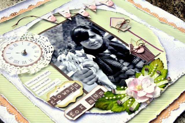
I love them all but especially the clock and the little twig with the hazel nut.


Plaquette-tampons.gif


Ok, so a few close ups before I get in charge of all the dirty clothes that are staring at me from the big heap on the floor!


The green leaves are cut from the elements sheet that has such great designs. The clock face and the clouds have become my favourites together with the leaves, but I have saved that layout for next time. Just teasing a little... :o)
I made the fan fromthe apricot paper and used some ink on the edges.
The gorgeous little butterfly from lazer cut chipboard is made by Imaginarium Designs. I just love their chipboard. Just the best in my humble opinion!


On each side of the photo I made a little cluster with the embellishments. The lace flower is by Webster's pages. I had this little idea recently to roll up paper and make it into little spikes or what to call them. They are decorative without being overwhelming.
You will be seeing them on quite a few of the pages I have to show you I think!


I decided to try a French title this time since I am doing this DT work for a French manufacturer.
Ravissante means Beautiful and that is what my daughter is to me,...inside and out.

I bought these letter sticker in France to match the new collection and they are by Prima.


I quite like the look of the distressing here. I tried to keep it slightly understated by using two sheets that were just overlapping so the distressed edges of both would show. In this way I tried to create an effect like a border for my page.
I lined the inside of my circle with a strip punched with a Martha Stewart border punch.
Tha fabric flowers were a gift from the lovely Irma Peredne. Thanks again!


Ok, so that was it for now ladies.

Please look back here for more
Les Papiers de Pandore pages.
I have many more to share, but they still lack the finishing touches.

I even have other pages that I am looking forward to sharing when I have some more time to post!

Have a lovely week and thanks for taking some time to visit!!
Related Posts Plugin for WordPress, Blogger...