Sunday 9 October 2016

'Fly Away' for Les Papiers de Pandore


I made this page for Les Papiers de Pandore using mainly the Carte Postal collection. 
It has so many lovely elements! You decide what direction the page will take, and this time I wanted to take the more clean and simple route. I still used more or less my usual techniques so it still feels like me, if you get what I mean... :-)


I used gesso, mist and paints on my background as well as my watercolour crayons by Prima.. The 'travel words' were added using a stencil by Tim Holtz and I must say I quite like the effect. I bought a couple of similar ones,but with other words and  you'll be 
seeing more of those come Christmas-time :-)


I cut out the cute hot-air balloon from one of the papers. The orange paper-strips with the sayings on were also from one of the patterned sheets. (But from the Sunny Bay  Happy Mail kit)


I used a die by Sizzix called Block Talk Bigz alphabet to cut out my title. The word 'Away' was first glued to a piece of plastic backing so it could sit slightly elevated from the page. The word 'magic' is from another set by Sizzix  'Holiday Script 2'.


That ends it for today. I hope you enjoyed my simple page :-)
See you soon! <3

Wednesday 14 September 2016

New autumn-winter collection from Les Papiers de Pandore

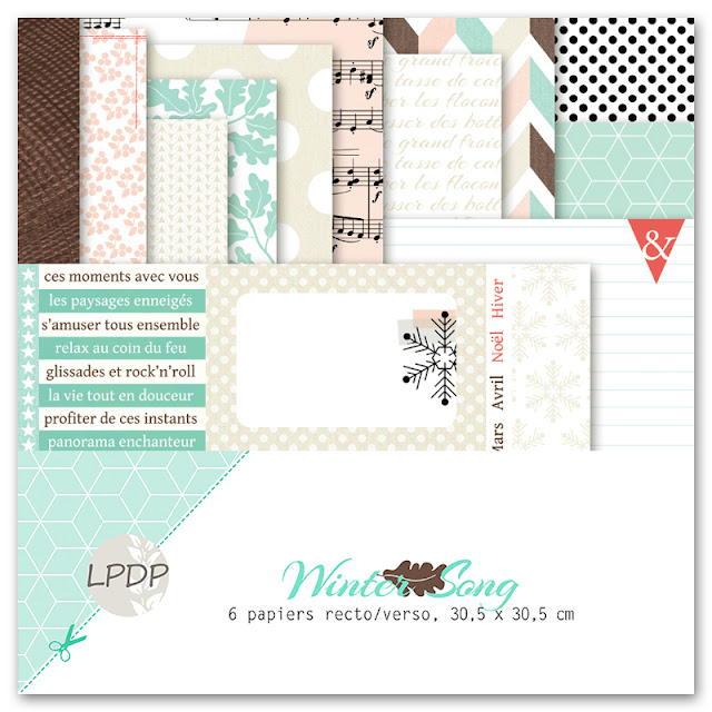
 Ahhhh!! Finally the moment has come to share with you the latest beauty created by my friend, Julie Blanc, of Les Papiers de Pandore. I find it hard to keep my patience until I'll see it in real life....


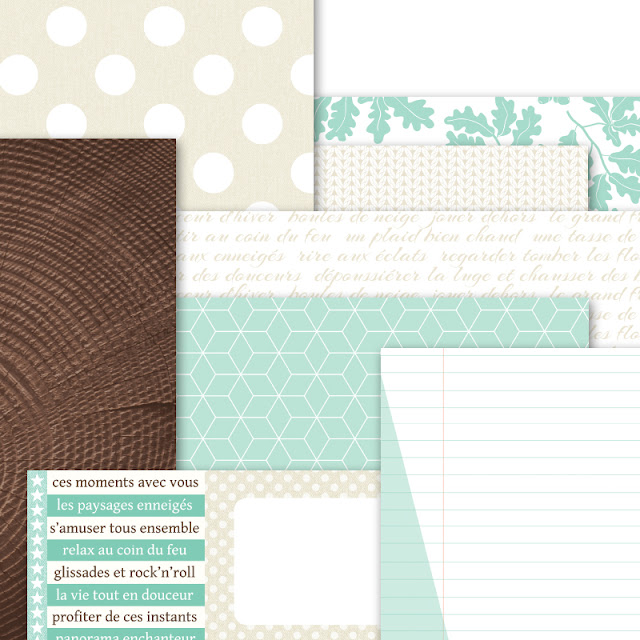
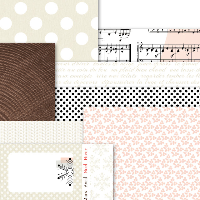
It's called WINTER SONG

This is what Julie has to say about it (Google Translated :-D )

 'Hello! I am pleased today to present Winter Song ... the sweetness galore for this collection based on wood, foliage and pampering! Friends, resellers, leaders and associations, you will get in contact with  Kirel Craft, and all other you will find this collection verysoon at your retailers as well as version Scrap Lyon ...'


'In addition to the mixture of all the leaves whose harmony is absolutely perfect, I have in mind several specific combos with this collection I am delighted to exploit ... From all mint-chocolate on nature ...'


'Or how about femininity, with a combo light peach, chocolate and ecru ...'


'This little introduction will give you a good idea of the overall versatility of this collection. We love it so much! You can now win this collection by taking part on Facebook, or on the Pandore blog. That means you have double the chance of winning it! :-)
What you do is comment on the posts and share on FB and your blogs.commenting on this post and share it on your blog ... On October 1 we will see who are the winners! 
Good luck!' 


Wednesday 24 August 2016

A shabby mixed media page for Les Papiers de Pandore

Hello there. 
It's really nice to be back with a layout to share again! It's been tooo long since I created a page....I bet some of you wondered if I would post ever again considering how quiet it's been  around here. It has actually been almost three months since my last post....!


I used primarily the latest colletion called Carte Postale, but also a few bits and bobs from other recent collections.  
The large flair button is from the earlier Crochetin collection.
I made the title with a little something I found in my stash and of course the flowers are almost exclusively by Prima :-)


I have been longing to do a little mixed media. On this page I used a light touch but had lots of fun. I have really missed getting my hands messy :-) Lots of gesso, paint, mists and other goodies here on this background that I created.


After almost everything else was in place I decorated with my Finnabair Art Stones. 
To match the darker papers and tie it all together I sprayed the 
stones carefully with  Tattered Angels Graphite mist. 
I love that it is not totally the hard black colour but rather 
a softer dark grey.
  

Ok, so that's it for today. 
I hope you enjoyed my page. I sure loved making it :-) ....

Hope to see you soon again!! 
I must say I'm really looking forward to some free time to visit all 
my favourite blogs soon! 


<3 <3 <3


Wednesday 1 June 2016

June Guest Designer for Scrap Africa.


Hi! Today I am happy to say that I am guest designing with Scrap Africa.
I was the wnner of last months challenge with this page and got to prepare a page for the June reveal.


Guest Designer Badge

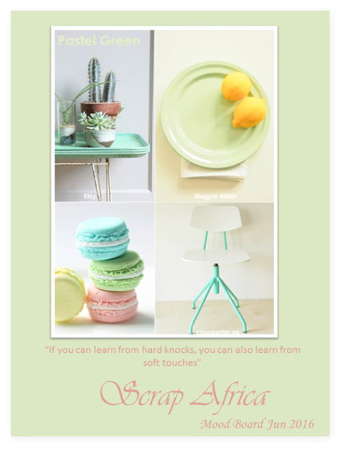
Here is the soft and beautiful mood board that Denise sent me:


It was a joy to create with this mood board. The colours are so yummy. Apart from the colours 
I was inspired by the stacked trays and macaroons to use layering on my page. 
I tried to add a couple of round shapes as well. 
The spidery legs of the chair are reflected in the stencilled swirl on the right hand side of my page.


Lots of Prima products here. Apart from the ever gorgeous flowers I used the leaf die and a few 
of their texture stamps.


I made some long 'branches' I had in my stash into a circle to put behind my matted photo as 
an added element of layering.


At the very bottom of my layers is a bit of cardboard box that I had rescued from the trash. 
I peeled of some of the paperlayer and  applied gesso and a few paints on top as well as more 
layers of patterned paper.


 Apart from the paints I used many different kinds of media on here. -Different brands of mists, 
water colour pencils and gel medium to stick down the different micro beads, pearls 
and art stones to name a few.


The flair button is by Prima as well as the wooden shape underneath it. I love the subtle elegance of the pink and green half pearls in the 'wilder' mixed media setting.


 Ok, so just a couple more close ups and I'm done! LOL! ;-D


Please pop over to the Scrap Africa blog HERE to see some gorgeous examples from the 
design team. I think you will feel inspired and want to take part in the June challenge as well. 
Looking forward to seeing what you create!!

Thanks for looking!!


Sunday 8 May 2016

'Simple Things' using 'Tales of You & Me''

Hello lovelies!!
Did you all have a good (Inter)National Scrapbooking Day celebration yesterday?
There was so much fun happening all over he web!!
I managed to join in the afternoon as I had prior engagements. I could still take part in a couple of bloghops, some giveaways and also enjoy a few hours of Prima Ustream get-together. I stayed up way past my bedtime (US are 7-8 hours behind,....) So today I am tired. But it was all worth it as it was all so much fun! I actually think we should get to celebrate this great hobby/lifestyle 
more than once a year!!  Heck, why not once a month!!?...


I managed to make this page, but other than that I was not very productive. But I loved watching others share their tips on how to do different things.


For my page I used the Tales of You & Me again.I still think it's gorgeous and 
I have many papers left,.... (So you'll see even mooooore,....) I prepared the background with paints, gesso, and stamps as always. I also added more mixed media ingredients in the form of Art Stones, tiny golden microbeads, and gold mica flakes. I used gel medium to stick it all down.
I coloured the art stones with Prima's Color Bloom spray;Tea Stain. The seambinding I used for my bows has the same colour as the Color Bloom mist.


 I did some paper-pleating a few years back and wanted to try it again. 
It adds a lot of dimension to the page I find.


I think it looks pretty neat,.... The flowers are different Prima ones, old and new. 
The die I used to cut the leaves is also by Prima called 'Forest Leaves'.


 Finally a side-shot to show a little bit of the dimension here. 
So many layers and bits tucked in between,...just the way I like it :-).
Thank you for taking a look and for any comments you may leave.
 I appreciae each and every one of you taking the time! <3

Hugs!

Saturday 30 April 2016

'You are my Anchor' using Prima's 'French Riviera'

Can you believe it!!,...? Another post from me already... :-)
Today I have made another page with the French Riviera collection. 
I used an older photo of my two youngest daughters that was laying on my desk. 
We actually have some gorgeous beaches here up north, shame the temperature does nothing 
to make me want to go there,....


The pretty flowers I used are mainly by Prima from the Cartographer collection. 
I decided they were a great match for my theme. The small daisies are from Bedtime Stories.
I actually mixed in some paper from 'Tales of You & Me', between the layers. I wanted to 
experiment and see what that would look like....


 I love the look of the Art Stones that I coloured with Blue Fern Studios mist 'Sky'.


Those die cut leaves are so darn pretty!!


Another close up of the layering and decorations.


This photo was taken a few years back. I have a feeling the girls will probably protest that they don't look their best. You know: 'hair is messy' etc etc,..but to me they always look like princesses :-D


Well done for getting this far,... Only one more close up and I'm done,...LOL!
Actually, I like it when I visit a blog and there are many pictures of the details. 
I feel I can get a closer look at the page, almost as if I were there. 
What do you thnk? Do you like to look at close ups on your blog round?


I will enter this page into the April challenge over at Let's Get Sketchy.


Thank you so much for visiting today. I hope you have a nice and restful week end <3
Hugs!


Wednesday 27 April 2016

A mixed media page using Les Papiers de Pandore's 'Carte Postale'.

Hi there!
Today I want to share a page using the new Carte Postale collection from Les Papiers de Pandore.
I love these new papers and also the stamp-set that have matching designs. Soo pretty!
You can see the ollection HERE


This was a really fun page to make. I used many of my mixed media goodies with the Pandore papers.
I started with gesso and some mists, then I added some watercolour pencils and some different media and things for texture. The Finnabair art stones are great for just texture and even the tiny microbeads.


The beautiful Blue Fern Studios chipboard got a lick of white paint and I even stamped with a small script stamp on top. You can see how I added the art stones inside the tiny frames while letting the dotted washi tape underneath shows through.


Here I used the 'Say Hello' from the stamp set and made a kind of a title together with the word 'friend' from the Sizzix Tim Holtz Friendship Script Words.
This is one of my fave  die cut word sets.


The large white flower is by Prima and  the leaves were made with a die also by Prima Marketing.


A couple of more close ups.As you see here;  with just small means you can achieve a lot of texture.


Finally I would like to share with you the challenge at Scrap Africa where I will be entering my page:
I actually took the liberty of adding some yellowy tones to the mix . (Initially I saw the lighter greens as yellow on my screen) My page kind of evolved on it's own. I took my inspiration from the first and last picture of the board. I associated to layering and mixing things up very freely.
And that suited my mood just perfectly

This is the enticing moodboard over there.


I hope you liked my page and maybe even feel a little inspired to create your own version of a mixed media page. They are just so much fun to make!!

Hugs and thanks for looking!! 


Saturday 9 April 2016

'My Beautiful Family', using 'Invitation' by Les Papiers de Pandore.


Hello and Happy Week End to you all!
Today I have a page for you that goes to show that 'oldie can be goldie'.

I used an older collection by Les Papiers de Pandore for a collection of pictures of my girls amd me. It's called Invitations and it was just lying there in my drawer, still looking so pretty,... I had to pick it up and do something with it. 
Just to let the papers shine I tried to do a version of 'clean and simple here :-) I don't know how much I succeeded though,...


I cut apart the callingcards and placed them on a sheet of patterned paper as frames for my photos.


I used a metallic copper-coloured sheet and one of the papers from the collection to form my title cutting it with a Sizzix alphabet called Alphanumeric
This alphabet is fabulous and you get several letters of each so you can cut out long words in one go. Just look at it HERE  (There is also a 'marquee' variation of it...)
I am actually quite into the recent trend to use gold and other shiny metallics on your pages. 
I find it looks very pretty, although here it looks more orange than copper :-)


Just look at the cascade of pretty flowers down the center of the layout. Most are by Prima Marketing, but there are also some from  Norwegian Papirdesign, I Am Roses and others from my stash. The resin key is Ingvild Bolme for Prima and the small green/black stickers are by Basic Gray. 


The word 'remember ' is also a die cut using my Sizzix die set 'Friendship Words', which I really love!! You can see it HERE

Do enjoy your Saturday and Sunday as much as you can and hug your dear ones!
See you soon!

XOXO


Related Posts Plugin for WordPress, Blogger...