Sunday, 25 September 2011
An earthy combo at Color Combos Galore using Hambly and woodgrain.
I can't believe it has been almost a week since my last post,...Where did time go?
This week at CCG the colours are tones of brown and tan with a burst of amber orange. The colours look very lovely together but I will admit that I had great difficulty going through my extensive stash looking for anything that would match the combo. I pulled out everything that would work and just added it all to my page.
Rummaging through my stash I found I have little brown and little or no orange. I realized I am more of a pink, green, teal,and cream girl.
But this is how my page turned out anyway;
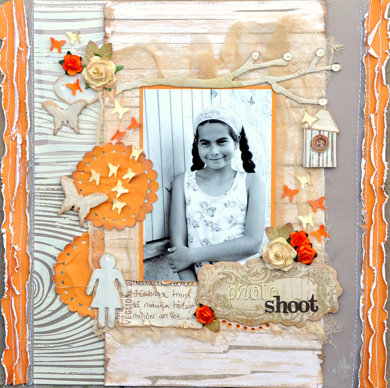
The designer challenge said use for example woodgrain and lined paper which I did. I used a piece of transparency by Hambly tht had a woodgrain pattern. I bought two but have still been hoarding them. They are so pretty. For the middle photo mat I used a paper from DCWV that has the pattern of a tree trunk.My journaling was written on some graph/lined paper from Prima arketing.
I had to use a lot of editing on this and the contrast I applied made my page look a little lighter than in real life.
And this is the Inspiration Board for this week;
And then the customary close ups;
The chipboard butterflies and the large branch are by House of Three, Parisian Anthology. The same goes for the piece underneath my title.I added some half glass beads to the tips of the branches.
The little bird house was cut from a piece of the Hambly woodgrain transparency and I made a small roof for it as well as added a tiny button.In the background underneath my photo mat I have use cheese cloth or muslin that I dyed with strong coffee to get the right tone of light brown. At least my lo smells good!
I put a lot of my embellishments down the side layered on top of the transparency. The round spots are made with a Spellbinders die.
I love to use a sepia or black/white photo with these kinds of colours. It can be difficult to find a suitable photo otherwise. I used Webster's Pages letter stickers for my title.
The photo was taken in Provence this Summer when Beatrice and I went for a walk and we had our own little photo shoot. We took a lot of nice photos and had a lot of fun until my memory card was completely full and it was time to walk home for a new one.
I hope you enjoyed looking at what I have been up to.
And a report on my computer,... As Monty Python would say IT IS NO MORE, it is completely deceased like the dead parrot.My two beautiful memory drives that were for all my photos had been ruined by lightning. When the nice computer repair man tried to replace them with a new one that one broke as well. So we have mutually decided that I have to make a change. Fortunately I made a copy of my pics in the eleventh hour and fingers crossed I got all of them. I have not been able to check yet. Now I am on the look for a new PC.
I am blogging (far too seldom, though) on Alexandra's laptop, but editing and posting on the laptop takes me FOREVER,...it does ...really!
Hope you are all enjoying your week end.
Bye for now!
Monday, 19 September 2011
Bright colourful combo at CCG. Use a portrait type photo.
Time for another rewarding challenge at Color Combos Galore.
When I first saw the combo I thought,... holy schmoly,..that's bright....
And it IS bright, but the two other colours do a lot to tone down the melon and orange this week.
I am not really an 'orange' kinda gal,...but look at this bright happy page that came from the combo.
Before I say more just let me share the happy combo we have for you this week;
I started with a paper from Pebbles inc and used gesso with a mask to create a background pattern.
I traced around the gesso with a pen.
I have been wanting to add cheese cloth to my layiouts but have not found any until now. I used it as a base for mytitle and embellishments.
The designer challenge called for a single person photo.This picture of middle DD Victoria was taken at Dan's 50th birthday party in August.
I found a paper with teal dots in my stash and wanted to use that as a base for my title.I did not have the right colour so I had to buy some letter Thickers in the right dark colour teal. The kit we received at Ingvild's workshop had some mini roses just the right colour so they came in handy.
The beautiful chipboard branch is from Imaginarium designs.
The dress form is from House of Three Parisian Anthology and I added some liquid pearl in grey.
I stamped the journaling in a very haphazard way.
You are most welcome over to CCG to see what all the talented girls of the DT have creatded!
Thanks for visiting me. See you soon again!
When I first saw the combo I thought,... holy schmoly,..that's bright....
And it IS bright, but the two other colours do a lot to tone down the melon and orange this week.
I am not really an 'orange' kinda gal,...but look at this bright happy page that came from the combo.
Before I say more just let me share the happy combo we have for you this week;
I started with a paper from Pebbles inc and used gesso with a mask to create a background pattern.
I traced around the gesso with a pen.
I have been wanting to add cheese cloth to my layiouts but have not found any until now. I used it as a base for mytitle and embellishments.
The designer challenge called for a single person photo.This picture of middle DD Victoria was taken at Dan's 50th birthday party in August.
I found a paper with teal dots in my stash and wanted to use that as a base for my title.I did not have the right colour so I had to buy some letter Thickers in the right dark colour teal. The kit we received at Ingvild's workshop had some mini roses just the right colour so they came in handy.
The beautiful chipboard branch is from Imaginarium designs.
The dress form is from House of Three Parisian Anthology and I added some liquid pearl in grey.
You are most welcome over to CCG to see what all the talented girls of the DT have creatded!
Thanks for visiting me. See you soon again!
Friday, 16 September 2011
At OUAS It's your turn to pick the winner! My layout using 3ndypapir, "Meeting Julie"
It is that time of the month again.
On Sept 15 the new OUAS sketch was revealed with all the gorgeous pages made by our guests and our designers.
The guest this month is the talented Stacy Cohen whom I have admired for the longest time.
We also have a beautiful page by Lisa Barrie, who won a guest spot with a fabulous entry earlier.
Remember that you ALL have the chance to win and be a guest designer!
It is such a wonderful opportunity.
Before I tell you more about the challenge I will show you my take on the sketch:
I used papers I had from 3ndypapir and I scrapped a photo of my friend Julie Blanc and me taken this summer in Provence. She is such a charming and lovely lady and it was great meeting her IRL. She is also a wonderful scrapper with an elegant style and runs the paper company Les Papiers de Pandore.
Let me not keep you in suspense;
This is what Nadia had to say about the challenge this time:
I cut the pp with the roses in two halves and made them overlap so the roses would go in the right spot for my design and with enough to be able to roll up the paper edge..
I sew on a couple of strips top and bottom instead of the punched borders of the sketch, and the rose patterned pp is also sewn on.
The two tags are from the elements sheet that contains vintage images and tags. Very pretty indeed.
I did some distressing and inking to get the right look.
I added some Prima roses and some older ones from my stash. The blue Prima swirl was a larger one that
I cut up to fit in on my page and design. The white swirl was made with a pearl string.
As I am still having serious computer issues I was not able to print on my photo and decided to just write my journalling and stick it on top of the photo. Just like that!!
As you can see my page is quite bulky,...they are really hard to fit into an album, so mostly they lay around or are stuck in boxes. If you have a good tip on storage it would be very welcome...
Thanks so much for visiting again and for any comments you might care to leave.
I know there have been quite a few blogger issues (again...) lately and commenting has been difficult.
I do appreciate them though when it all works!
I will leave you with a few tips about our sponsors this fortnight.
3ndypapir is a tiny, Norwegian design company.
On Sept 15 the new OUAS sketch was revealed with all the gorgeous pages made by our guests and our designers.
The guest this month is the talented Stacy Cohen whom I have admired for the longest time.
We also have a beautiful page by Lisa Barrie, who won a guest spot with a fabulous entry earlier.
Remember that you ALL have the chance to win and be a guest designer!
It is such a wonderful opportunity.
Before I tell you more about the challenge I will show you my take on the sketch:
I used papers I had from 3ndypapir and I scrapped a photo of my friend Julie Blanc and me taken this summer in Provence. She is such a charming and lovely lady and it was great meeting her IRL. She is also a wonderful scrapper with an elegant style and runs the paper company Les Papiers de Pandore.
Let me not keep you in suspense;
This is what Nadia had to say about the challenge this time:
"Welcome to our next challenge for the month of September! I am so excited to post this challenge as my super AWESOME Design Team have been thinking of ways to throw some twists in how we pick the winner. We thought it would be fun for you all out there to pick the winner! This challenge will end on the 29th of September , which is 2 weeks from today and you will all have a chance to vote for the winner and Top 5 projects for one whole day on the 30th of September before the new challenge is posted on the 1st of October.
The catch here is that everyone can only vote 1 time, but of course you can get everyone you know to vote for you! As it gets closer to the day I will remind you all, and we just cannot wait to see who you will pick!"So on to our September 15th challenge.
Journalling Criteria: This time you need to journal 2 lines directly on your photo. You can write on your photo, you can print your writing on your photo, you can use journalling strips on your photo etc. There is no theme this time, just a journalling technique criteria.
I cut the pp with the roses in two halves and made them overlap so the roses would go in the right spot for my design and with enough to be able to roll up the paper edge..
I sew on a couple of strips top and bottom instead of the punched borders of the sketch, and the rose patterned pp is also sewn on.
The two tags are from the elements sheet that contains vintage images and tags. Very pretty indeed.
I did some distressing and inking to get the right look.
I added some Prima roses and some older ones from my stash. The blue Prima swirl was a larger one that
I cut up to fit in on my page and design. The white swirl was made with a pearl string.
As I am still having serious computer issues I was not able to print on my photo and decided to just write my journalling and stick it on top of the photo. Just like that!!
As you can see my page is quite bulky,...they are really hard to fit into an album, so mostly they lay around or are stuck in boxes. If you have a good tip on storage it would be very welcome...
Thanks so much for visiting again and for any comments you might care to leave.
I know there have been quite a few blogger issues (again...) lately and commenting has been difficult.
I do appreciate them though when it all works!
I will leave you with a few tips about our sponsors this fortnight.
3ndypapir is a tiny, Norwegian design company.
Owner and designer Gudrun Loennecken creates all the whimsy, vintage patterned papers. These papers are perfect for all paper lovers: cardmakers, scrapbooker and all papercrafters.
It is all designed and printed in Norway on heavy weight, high quality paper
Our web adress is: http://3ndypapir.blogspot.com/
Our second sponsor is the truly AMAZING...
Imaginarium designs, is a new chipboard company founded in 2010. It is the combined collaboration of a Mother and Son team who both work in the paper craft industry.
And they are sponsoring our DT the whole year long,...Fantastic!!
Thank you SO much to our lovely sponsors . We couldn't do this without your support!
Wednesday, 14 September 2011
Autumn beauty, a layout for Les Papiers de Pandore
4This is the latest layout I made for the French paper manufacturer.
Almost everything on here is from Les Papiers de Pandore.
The only other stuff is twine, buttons and flower from my stash.
I photographed the layout on the stairs outside my house.
And a few more close ups. I do not have a lot to say , nor the time ,today,....sorry!
And this is the finished layout without any distractions...
Don't you just love those little birdhouses and the clouds. All from the cut out sheet in the "Promenons Nous" collection.
Hope you enjoy the rest of your day!
Almost everything on here is from Les Papiers de Pandore.
The only other stuff is twine, buttons and flower from my stash.
I photographed the layout on the stairs outside my house.
And a few more close ups. I do not have a lot to say , nor the time ,today,....sorry!
And this is the finished layout without any distractions...
Don't you just love those little birdhouses and the clouds. All from the cut out sheet in the "Promenons Nous" collection.
Hope you enjoy the rest of your day!
Subscribe to:
Posts (Atom)


