Friday, 27 April 2012

A very simple page for the rainbow challenge and how i made it.

In my previous post I told you the good news that I had been invited to join the team at 'My Scrapbook Nook'. In the ten or so days from the finalists list was published, a series of chats and challenges etc were taking place in the forum at the Nook (so they would get to know the candidates better before making the final decision.)

One of the other applicants Sarah/Pinkalishious posted a fun picture for us to be inspired by.

This is the very uncharacteristic page that I came up with,
(and I am not sure that I like it much ,...lol!)


 And this is the fun photo that made me go crazy and put colour all over my page...


As you can see my page is definitely a more low-tech version of this,...lol!
But I will,however, share with  you the very simple steps leading up to the finished page.


 At first I cut strips from a striped paper by October Afternoon. 
I wet the strips and rolled them them up into little balls.  
Then I waited until almost dry.


 I wanted to create the shape of a rainbow.
While still damp I arranged my strips to my liking.
(As the strips are damp they can be formed more easily.)
I actually used a large plate to get the right shape.


I found a lid in the kitchen to use as a template for a circular mat on my page.
My first plan was to use a pp with old garden equipment to emphasize the low-tech nature of my take.
 But I then I saw that the yellow circle would cover up the fun part and decided on a more discreet pp.
I distressed the paper and passed it through my sewing machine :-)


 I now have most of the outlay of my page ready.


 I use an ordinary stapler to secure all the bits to the base.
I wanted to change the look of my 'rainbow' a little so I actually  cut some more strips and added to each side of it to make it longer.You don't see that here.

  A layout of mine 'needs' flowers and/or buttons so I added a couple , -but small ones.
I also added a horisontal band underneath the circular paper (for balance and some added interest).

  Here is another look at the finished page.
I like to use black/white photos with these kind of bright colours.

The journalling says:

"Spring is finally here.You and grandma love to cultivate things in the garden.
You like to plant and sow seeds in your old sandbox.
And over by the playhouse you have planted 'Lily of the Valley'."

Thanks for dropping by today!!


Thursday, 26 April 2012

Guess who made it to a new exciting design team.....And a peek at the new Nook kit!!

I told you a couple of weeks ago that I actually made it all the way to the finalists list 
at "My Scrapbook Nook". I was veryhappy and content to have come that far. 
After 'getting to know the competition' as they say and seeing what an awesome 
bunch these ladies were, I could hardly believe it when I saw my name there on the very short final list with only three more names on it.
Had I known that they were looking for so few I would never have had the audacity to apply.
Good job I didn't know because I WAS ACCEPTED...YAAAYY!
Ok, no more fooling around!

I was accepted together with these very talented ladies:

 
and then most of the old team stayed on.
(They are pretty awesome,too)
Here is a photo of the next kit;


It is the Echo Park collection called "This and That Graceful"
Who would not want this ...?
But to make it even more tempting let me just sweeten the deal;

Join in May and receive June for FREE along w/a free June Grab Bag. You only pay the shipping for your free kit and grab bag!!!! You will also receive another free kit after 12 paid months!!! Two FREE kits and a grab bag when you sign up for 12 months!!!!!
That's the short version, follow this link and you can read all about it and see pictures,too.


It is far past my bedtime,...again...
This is what I had to say today. Tomorrow if I have time, I will be back to share a lo I made for a friendly challenge between the finalists while we were waiting. It is not typical of how I normally scrap and I can say this much,..I do NOT believe it was this lo that got me the gig ...lol! Probably had the opposite effect,
but I will share it anyway

Nighti-night!


Tuesday, 24 April 2012

Color Combos #228. A birthday card for a beautiful friend

Hi all! Here is the inspiration board that we have been waiting for. 

We have some gorgeous colours and the extra challenge is to use some kind of natural material on your projects. I used some strands of burlap on mine. I just cut hem in half and glued them down.
Easy peasy...


I made this card for a dear friend who had her birthday yesterday.
(Lovely talking to you yesterday, E.)


First I sent off this picture to Janet:


Can you just see the difference in colour...?
I guess this proves it's true when people say  "....But my card has a totally different coulor IRL
and it really does match the combo,,..." ... LOL!
I am just glad I saw it. I needed to be upstairs on the computer with the big screen to notice.

I have so much on my plate today that I will leave you with this an rush off...
See you soon again!

Hugs!

Saturday, 21 April 2012

Ready for Color Combos challenge #227. Two layouts this time!

This weeks challenge apart from the obvious prompt to use the four colours, is to use some kind of mesh on your layout.

I found a piece of lace netting from Websters Pages that was just the right colour. I used that one on both my pages, but in different ways. I also was lucky enough to find a small scrap of white that I had completely forgotten about!


Here you can read all the small print concerning the challenge.


I actually made two pages this time. I made this one first  but couldn't really decide if I liked it or not,
and then I made the next one and still could not decide. So I sent both to Janet and said that she could decide. Then she told me that oh no, she was not going to decide either, and there you are; two pages!


                     Inspired by Shape: (Jar) Use the contour of a jar or bottle as a stamp


I quite liked the saying on this diecut from Authentique Papers. I have used their paper collection called "Journey" 

"Go where there is no path and leave a trail"


 This is the 'shadows of grey' mesh from WP that I added to my page. I painted a small chipboard butterfly from my favourite brand Imaginarium Designs using a white stamp pad. For the other ID chipboard I used some white dimentional paint.


 I found some fabric latter stickers from Prima that was just the right shade of lavender and also a small mulberry flower from my stash as well as some buttons. 
It is not the easiest of colours to find actually....

Now for my lo mumber two:

I am not 100% sure but I think this may be the very first time I scrap  a photo with just me in it.
By time some might say, and I tend to agree. It is just rare that I  like a photo enough for me to want to scrap it. This one was taken by my sister when she came to visit us in France.
You may recognize it as my new avatar on some sites.
 

         Inspired by Shape: (Polka Dots) Use round or circular products like buttons, beads, doilies


 Not a whole lot to say about this one. 
I painted with lavender paint and some white gesso to make the base a little more interesting. 
The grid paper is from one of the Prima ledger pads. 
                                                           I find they are quite handy

 Beautiful Prima blooms..


 The black swirl is a leftover from a larger one that I have used on sveral layouts.

The chipboard butterflies are ID ones , same as the ones in the first lo. I painted them with lavender acrylic paint and added some silver beads to them.


Finally a close up of my journalling. I think this is so,so true!

To those of you who made it to the end; well done! I normally only do one lo per post as I like to add my close ups, but this time it seemed better to do both at the same time.

Thanks for taking the time to come and visit me. 
Enjoy your Saturday!


You can find it HERE

.


Friday, 20 April 2012

A new colour challenge at Les Papiers de Pandore.

 Well ladies, we are at the 20th of the month and as the new regime says 
we have a colour challenge at the Pandore blog!

The colours are pinks and yellow combined with a lovely purple, and a white to help it all 
blend together. Actually very nice colours for a spring layout.

I have loved the earlier collections that Julie created so much that I have used up almost all the papers.
But anyway, this is what I came up with:


 The photo was taken in Cabasse, Provence, where we as a family normally spend our 
Summer holidays.The girls and I were playing boules at the track down by the brook.


And this is the inspiration that Julie has found for us. I love the colours. Of course you can choose to take other kinds of inspiration from the picture as well, as long as you use the colours as your starting point. You can for example use the outlay of the photo as a sketch. That would be fun I think!


 Some close ups of my layout:


 I cut out the butterfly from the patterned paper. The black plastic doilies are made by Maya Road.


 I took this next picture to show that my layout is not flat. This time I wet the pink paper and scrunched it up. Then I put it on top of the radiator to dry before glueing it to my page. I like the effect and the paper is more likely to keep it's shape than if you had kept it dry


I  used cheese cloth behind the corrugated cardboard and yellow mist for the  more colour. 
For extra interest I even added some splashes of 'Earl Grey' mist from Maya Road. 
I added lace for softness. This is one of my favourite photos from last Summer!


I hope you feel inspired and that maybe you will take a look at our challenge over at the Pandore blog.
Thanks for saying hello!


.

Thursday, 19 April 2012

Reminder OUAS April, and a feature for me.

As you may have heard our challenges at OUAS are now monthly.

This is the sketch that was revealed during the April Ist bloghop. 

The theme of this challenge is 'Home' .

We would like you to create a layout and interpret the theme 'Home' however you like based on the following sketch. You can journal as much or as little as you like, but your layout must incorporate this theme and this sketch.

You still have ten more days to complete the challenge and I hope you will share your beautiful creations with us.

We have some wonderful guest designers too, and you are very welcome over to OUAS to find out the fine print!

I also have some happynews to share

I entered a layout that I called "It Never Rains in Monte Carlo"into the recent challenge at Sketchabilities and I was  content to see that it got featured.
Here you can see the other features, too:


For a look at the sketch just scroll down a couple of posts and you will see it.

Thanks for dropping by!

.


Saturday, 14 April 2012

Color Combos #226, and some good news...

Hi and welcome to have a look at the new challenge over at CCG.
This week is cards week, or actually you can create a tag or an off page project too, if you prefer.
 I am sure you agree the colours are yummy for a spring card.


Take a look at the bright and lovely inspiration board and it will tell you all about this challenge.

I'd like to share with you the card I made for this one:


 The patterned paper in the yellow/green colour is from a ledger pad by Prima and the sentiment is from The Scrapcake.


Not much more to say about this card. It is pretty straight forward... :-)

Now to my good news!

Some days ago I sent in my application to be part of the My Scrapbook Nook DT.
I had been thinking about it, but I am no good at getting applications or submissions sent and this being late in the evening on the due date, it did not look hopeful :-)

 What made me do it was something I read . I think it was on the message board.
. Someone said "You never know what Leah is looking for...."
So I decided to give it a go. Maybe she is looking for me... :-D

Yesterday I found out I was on the shortlist....Which still is rather too long for my liking...LOL!
There are a lot of talented ladies with lovely styles who are very qualified for the team, so I am not taking anything for granted. If you know me you will know I am rather the opposite ...LOL!

Anyway it is cool to have made it this far and I will keep my fingers crossed and see what happens!

I am off to pick up my girls from the bus. They went to the cinema and left me in the house to scrap!
I hope your week end is a good one and that maybe you get to do some scrapping too.
Hugs!


Tuesday, 10 April 2012

A layout for Sketchabilities using Pandore's "Cherry Cherie" "It Never Rains in Monte Carlo..."


Today I have a page to share that I scrapped with the latest collection from 
Julie Blanc's Les Papiers de Pandore. It is called "Cherry Chérie". 
I scrapped the page using a sketch from Sketchabilities as inspiration.
This is my page:


 And this is the sketch from Sketchabilities:


 My take on the sketch was pretty straight forward and here you can see some close ups.


 As my journalling explains we were in Monte Carlo in Monaco on the French Riviera. We had dinner at the Café de Paris and the rain kept pouring down. I remember very well the noise made by the rain on the wonderful glass roof of the utterly posh restaurant. Outside the restaurant, and next to the famous Casino, they were selling these elegant umbrellas. The funny thing was they had a printed text claiming that "It never rains in Monte Carlo".I can so vouch for that not being completely true,...lol!


 I used a small swirl from Imaginarium Designs that I painted a suitable shade of red using my paint dabber. There will be a link to the flourish at the bottom of my post.


 Underneath my journalling is the trusted Cheery Lynn doily that is so well loved everywhere at the moment.


Thanks for taking the time to visit my blog. Have a great week!


.

Sunday, 8 April 2012

Featured designer at Creative Scrappers. "MME Follow Your Heart". Sparkle for BIW

Hi all, I swear I do not know what happened, but suddenly all the content of my post was gone. I just recently noticed as I was getting the link to upload to face book. I got a couple of comments early on so I know that it was there....

So sorry for those who came and saw nothing. You are very welcome back!

I will just upload my pictures again and tomorrow if I have time I will write something little about it all.

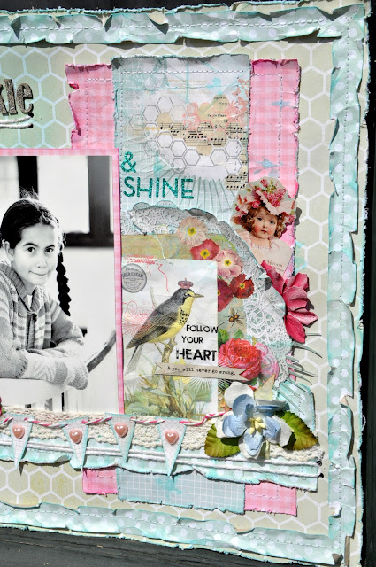
Some time ago Kristine at Creative Scrappers asked for scrappers to send their applications for the opportunity to become featured designers. I did and I am thrilled at the chance to be a guest artist at Creative Scrappers for the current sketch.

This is my layout:


 Ths is Amarilys beautiful sketch:

 I used the lovely new collection from My Minds Eye called "Follow Your Heart" by Rhonna Farrer.


 I am also entering my layout in the challenge over at Bird is the Word. 
The word this time is "Sparkle".


I used some Tim Holtz distress stickles to add some extra sparkle to my "Sparkle"


I cut away some of the small hexagons in the patterned paper in the background. I did this to counterweigh all the  patterns and embellishments on the other side of thephoto. I think it works quite well.


As you can see I have used quite a few layers building up the embellishments underneath the banner. 
I am quite fond of my twinw these days and it is so versatile.


I apologize againfor the trouble with this post.
Thanks for visiting and have a great evening!
Related Posts Plugin for WordPress, Blogger...