Saturday, 9 April 2016

'My Beautiful Family', using 'Invitation' by Les Papiers de Pandore.


Hello and Happy Week End to you all!
Today I have a page for you that goes to show that 'oldie can be goldie'.

I used an older collection by Les Papiers de Pandore for a collection of pictures of my girls amd me. It's called Invitations and it was just lying there in my drawer, still looking so pretty,... I had to pick it up and do something with it. 
Just to let the papers shine I tried to do a version of 'clean and simple here :-) I don't know how much I succeeded though,...


I cut apart the callingcards and placed them on a sheet of patterned paper as frames for my photos.


I used a metallic copper-coloured sheet and one of the papers from the collection to form my title cutting it with a Sizzix alphabet called Alphanumeric
This alphabet is fabulous and you get several letters of each so you can cut out long words in one go. Just look at it HERE  (There is also a 'marquee' variation of it...)
I am actually quite into the recent trend to use gold and other shiny metallics on your pages. 
I find it looks very pretty, although here it looks more orange than copper :-)


Just look at the cascade of pretty flowers down the center of the layout. Most are by Prima Marketing, but there are also some from  Norwegian Papirdesign, I Am Roses and others from my stash. The resin key is Ingvild Bolme for Prima and the small green/black stickers are by Basic Gray. 


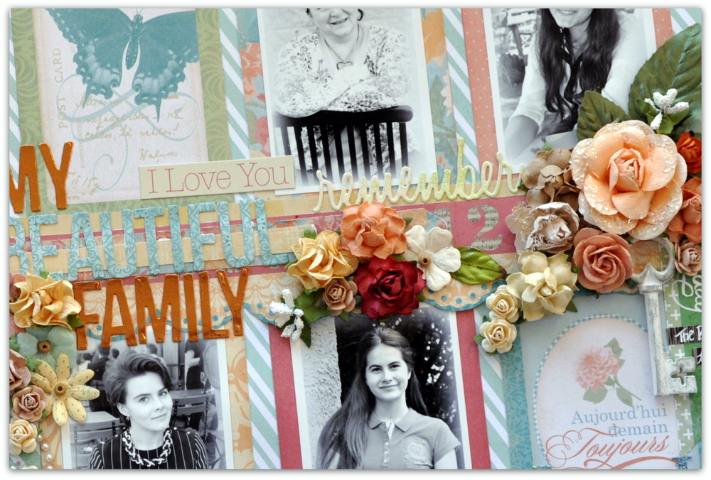
The word 'remember ' is also a die cut using my Sizzix die set 'Friendship Words', which I really love!! You can see it HERE

Do enjoy your Saturday and Sunday as much as you can and hug your dear ones!
See you soon!

XOXO


Sunday, 3 April 2016

'Sweet Summer Memories' using Prima's French Riviera collection.

Another page from me in less than a week.... 
Now that I have more time for scrapbooking I hope to have something scrap related to share on a more regular basis. I am using some of my new supplies and having a lot of fun. Do you remember the other day I told you I was working on a page using the new Prima collection 'French Riviera', 
well here it is:


I picked the pretty woodboard paper and played with some mixed media supplies on top. 
I used an older photo that was actually taken in Provence (where we have spent so many Summers over the years). This one was taken at least four years ago...

Here is a photo strip sharing my process:

1.Painting my flowers with some blue mist. 
2. Painting my doilies
3. The bare basics, page setup before adding photo and embellishments.


I used my Prima metal dies for the doilies and the leaves. I dyed the doilies using different mists and sprays (Blue Fern Sky, Prima color Bloom and another one from my stash I dont know the name of)


I used chipboard fromm Blue Fern Studios for a bit of extra texture. 
This one is called Quatrefoil Panel and I only used a piece of it.


I love the look of Fainnabair's gold mica flakes. They are so shiny and pretty and add 
a lot to the page. I even used some Finnabair Art Ingredients clear glass beads.  
I added them both to the Ingvild Bolme resin frame and inside the chipboard design.


I added a couple of yellow flowers from my stash to echo my DD's yellow shirt. The fabric flowers were part of a glorious RAK from my dear friend Eila, one of the nicest ladies in scrapbooking.


This is quite a layered page as you can see from this view. I used thick cardboard 
between the layers of paper and between the photo and photo mat as well.


That's all for today. Thanks for dropping by and for any comments you leave me. 
I hope you enjoy the rest of the week end!!

Monday, 28 March 2016

Yay, first time entering the Prima product pick challenge. (Tales of You and Me)


Hi there friends! 

Finally I have been scrapping up a storm and at last I have something to show you!
This page was made for a challenge on the Prima Marketing blog. At the start of each month I mean to play along with the challenges there, but DT assignmentss have often got in the way. 
I have cut down a little on my obligations recently and have more free time and finally made a page
for the Prima Product Picks challenge. (I have posted the mood board below my page.)

A while back I made a post with a few of my favourite new products  from CHA and not 
long ago I was able to get my hands on some of the new Prima Marketing goodies.
For this page I used Frank Garcias latest collection called 'Tales of You and Me'. It's gorgeous!!
(I actually bought the 'French Riviera' one as well, but that will be for a different post :-) )


Here is a LINK and a picture of the Prima Marketing product pick mood board:


On my gessoed background I used a lot of colour including Prima Color Bloom sprays, Prima Watercolor pencils and ink. I used several of Finnabairs smaller stamps to create texture. 
I love all the different smaller patterns together. 


I also got hold of a few die sets by Prima. I got two sets of doilies and a set of pretty leaves.


As you can see I had some fun doing a little fussy cutting from one of the patterned papers 
in the collection. I made the title with some coordinating stickers.


I guess you can see from this picture why I love these flowers so much. 
These are two different shades of pink and  come from two different packages. 
Similar but not the same, They are just the prettiest.....  
They come in many shades and are called Bel Canto H <3 <3 <3


A new acquaintance for me are the new Art Stones. 
They are quite fun to decorate with and next time I will add colour to them as well. 
Here I mixed them with some lovely shiny gold Art Ingredients Mica flakes.


The flair button is from a set by Prima that also came with a stamp.
It's actually from the Jodi Lee 'Princess' collection.


A close up of the textures I created. Lots of yummy layers just the way I like it!!


I hope you enjoyed my entry for the Prima Product pick, ie colour challenge for March.
I am pretty content that I finally got a page in!
Thank you so much for looking!!


Tuesday, 22 March 2016

New collection from Pandore, 'Carte Postale'.


Today I can finally share with you this beautiful new collection from Julie Blanc and 
Les Papiers de Pandore. Apart from the obvious that it is a very attractive collection, it will also 
come in handy soon when time comes to scrap all those travel and hooliday photos.


This collection has so many lovely designs and it's going to be pretty hard to choose 
what side of the papers to use,... :-) I cannot wait for it to arrive and to see it IRL!!


This is the collection for you if you are looking for something that is great for both 
girls and boys pages. Watch this space ... :-)


Related Posts Plugin for WordPress, Blogger...